Environmental Design: Canadian Landscape
This project was centred around characterizing an environment, illustrating a character’s life and times without depicting figure. I chose to highlight artifacts and the exterior environment to accomplish this, supported by colour and temperature control.
I quickly realized that the project was complicated by common conceptions around the Canadian environment- notably the gothic or haunted nature ascribed to it. As an Indigenous person, I reject the haunted concept because it is too often linked to the spectralization of Indigenous peoples. We do not haunt Canada, and Canada should not be haunted by its sins, it should be seeking conciliation.
To work against these, expanding into new areas, I chose to highlight an Indigenous writer - working from the story of the spirit of greed in Robin Wall Kimmerer’s Braiding Sweetgrass. This narrative deals with disruption and regaining equilibrium, both environmentally and spiritually. I chose a five panel series to highlight the four seasons and one fresh start. This also mean I could leverage the seasons as metaphor, extending their meanings, colours and temps while building off their chronicity through a day/ night cycle.


Environment Design: Genre Mashup
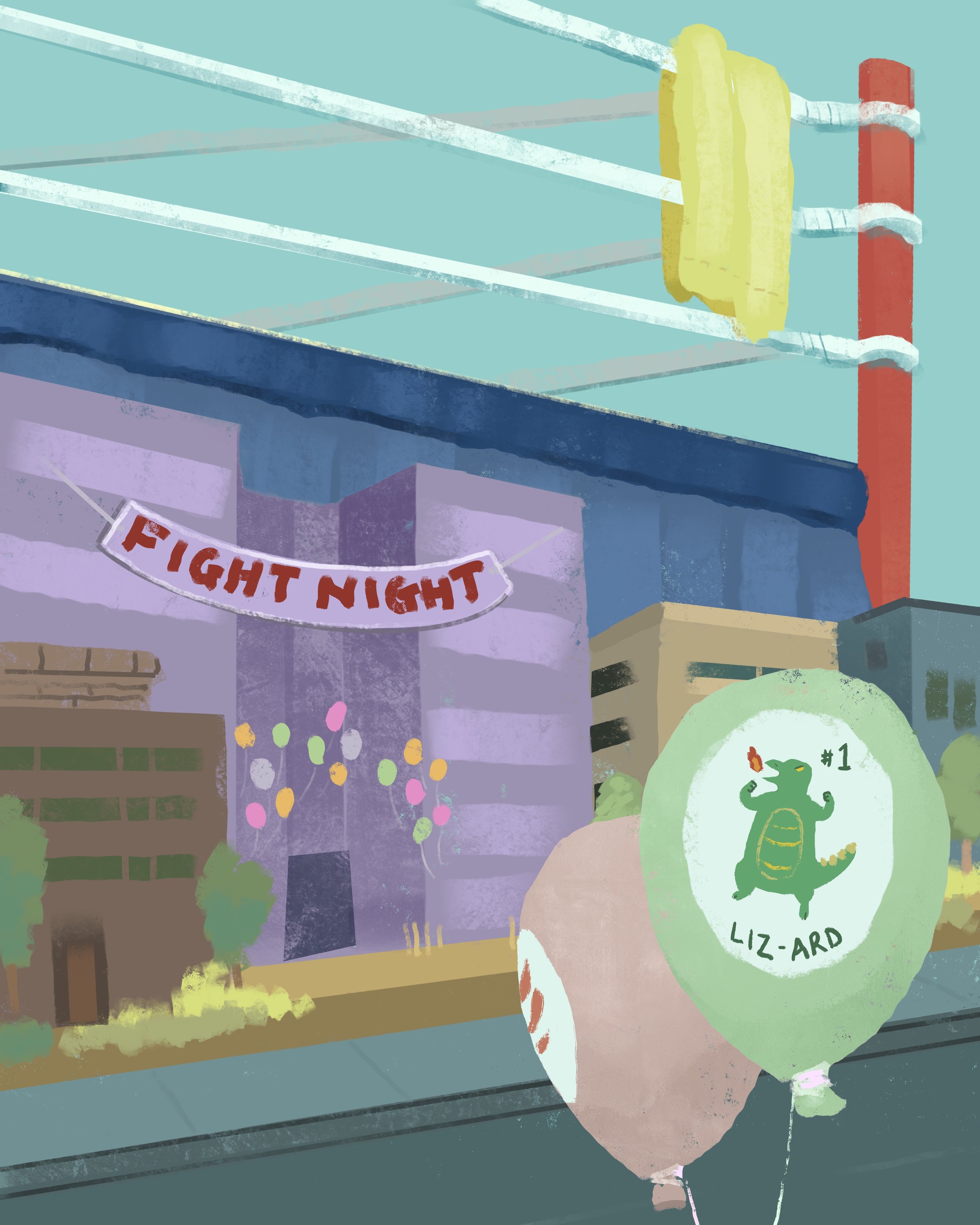
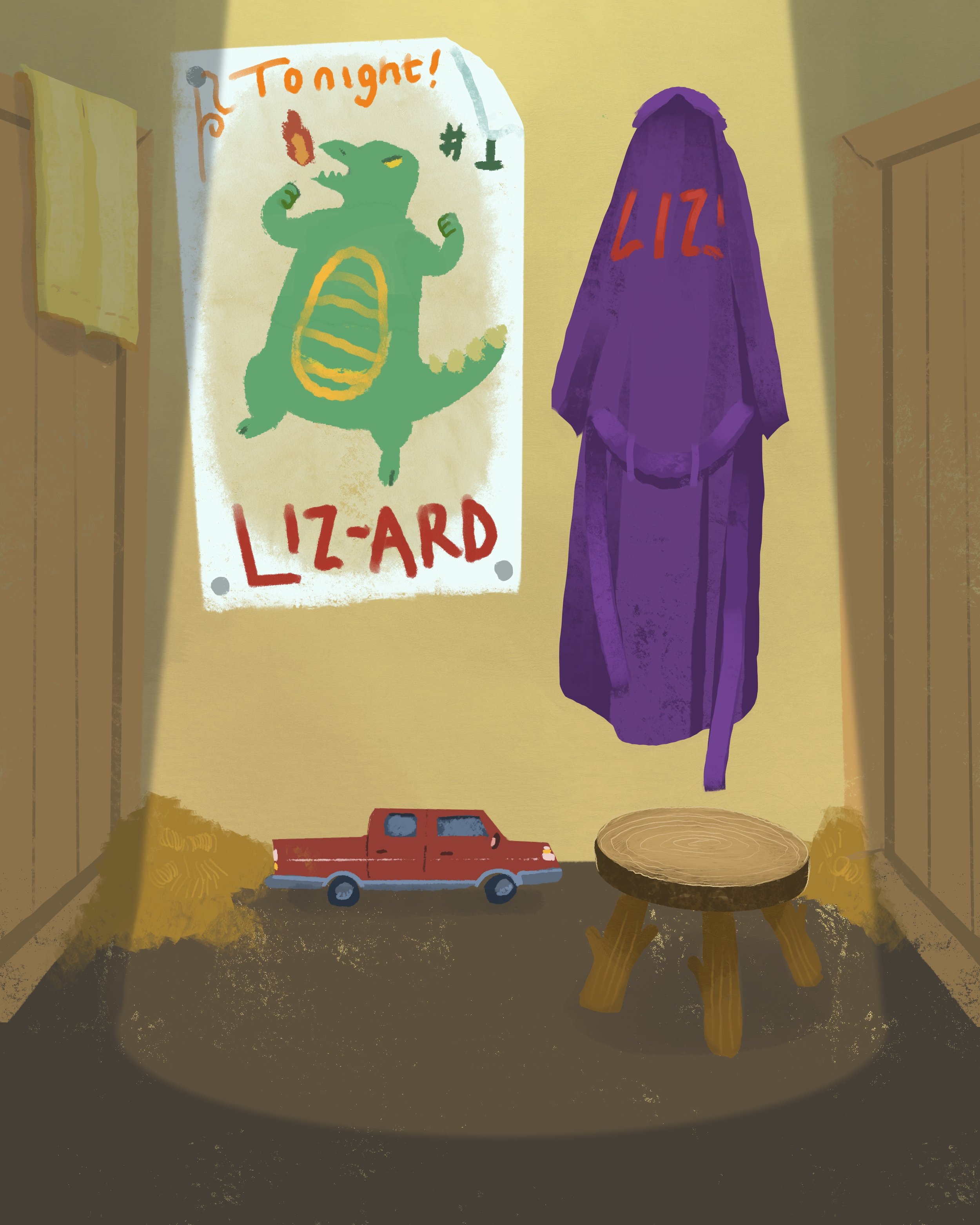
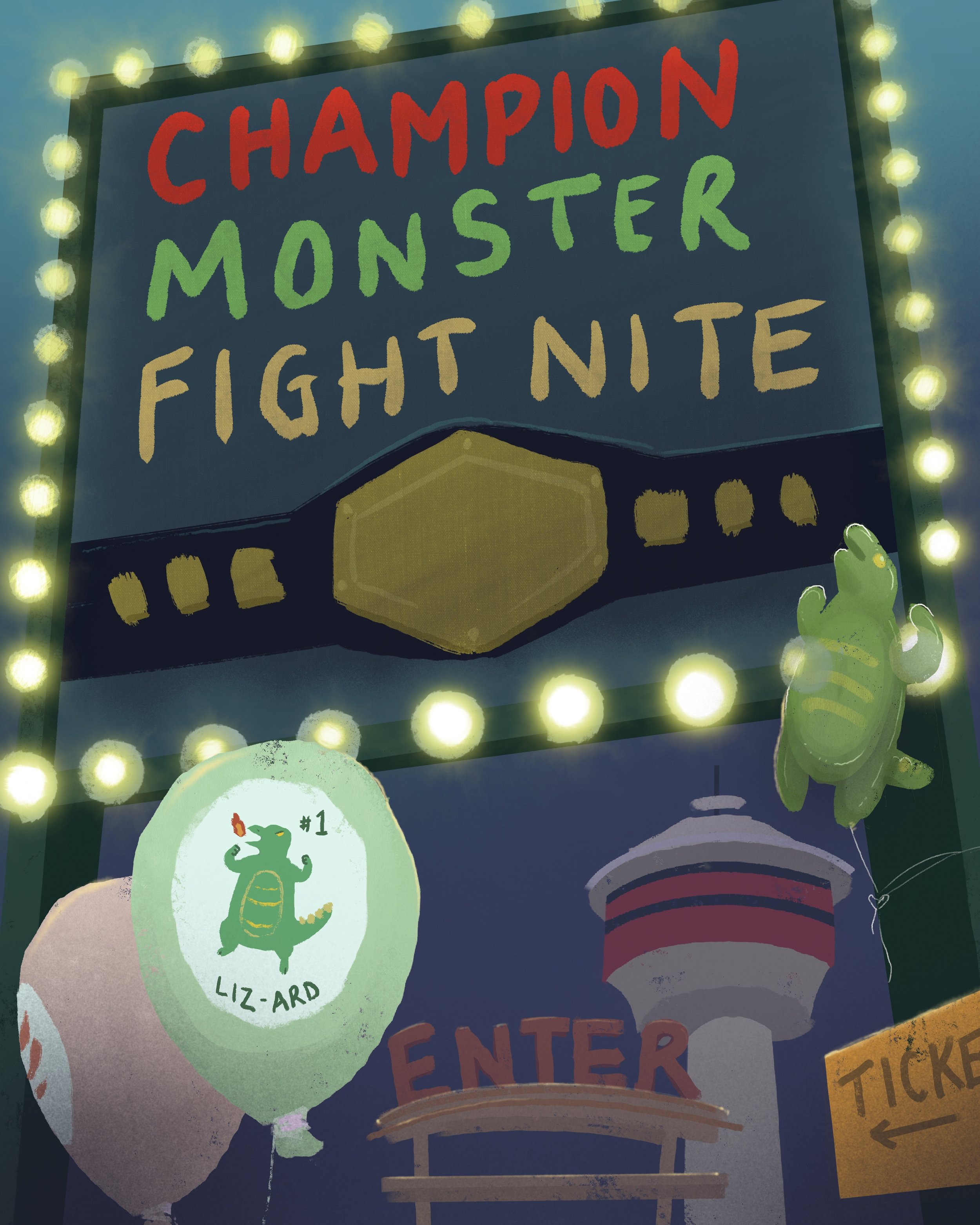
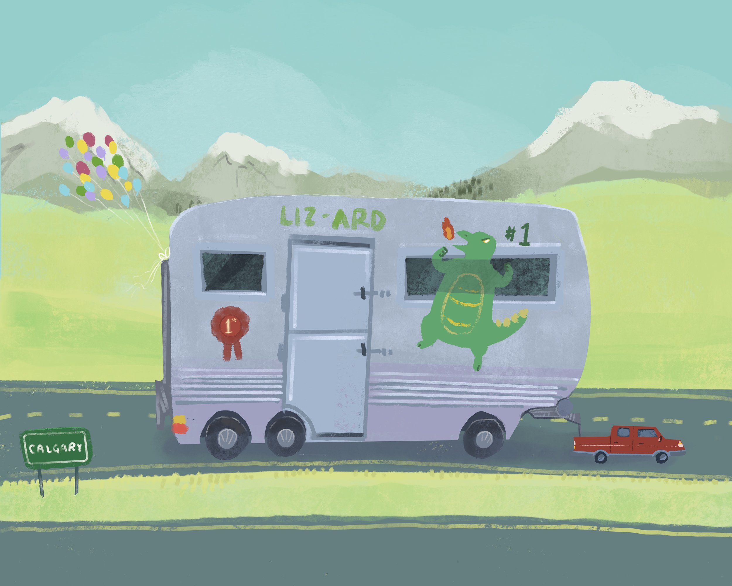
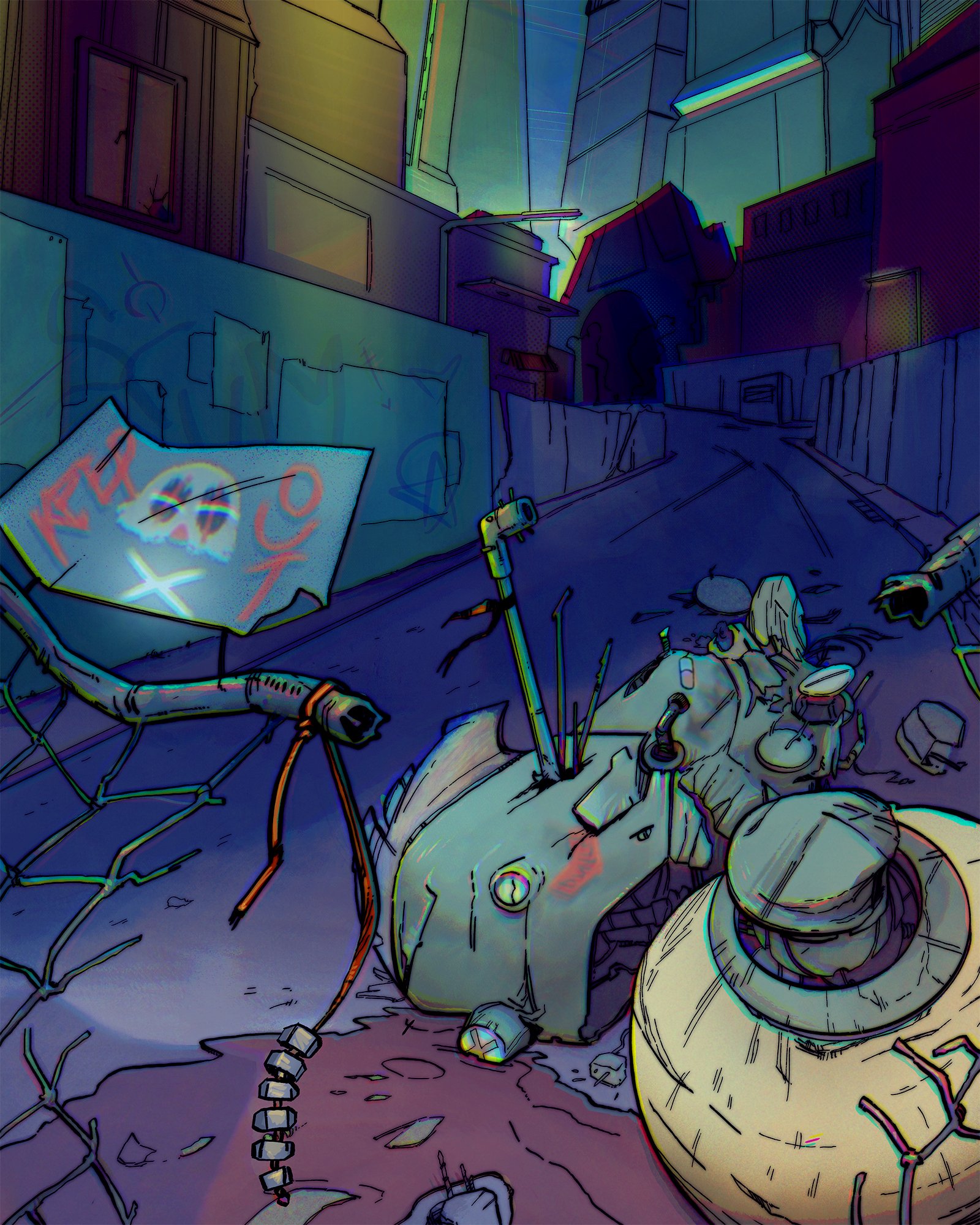
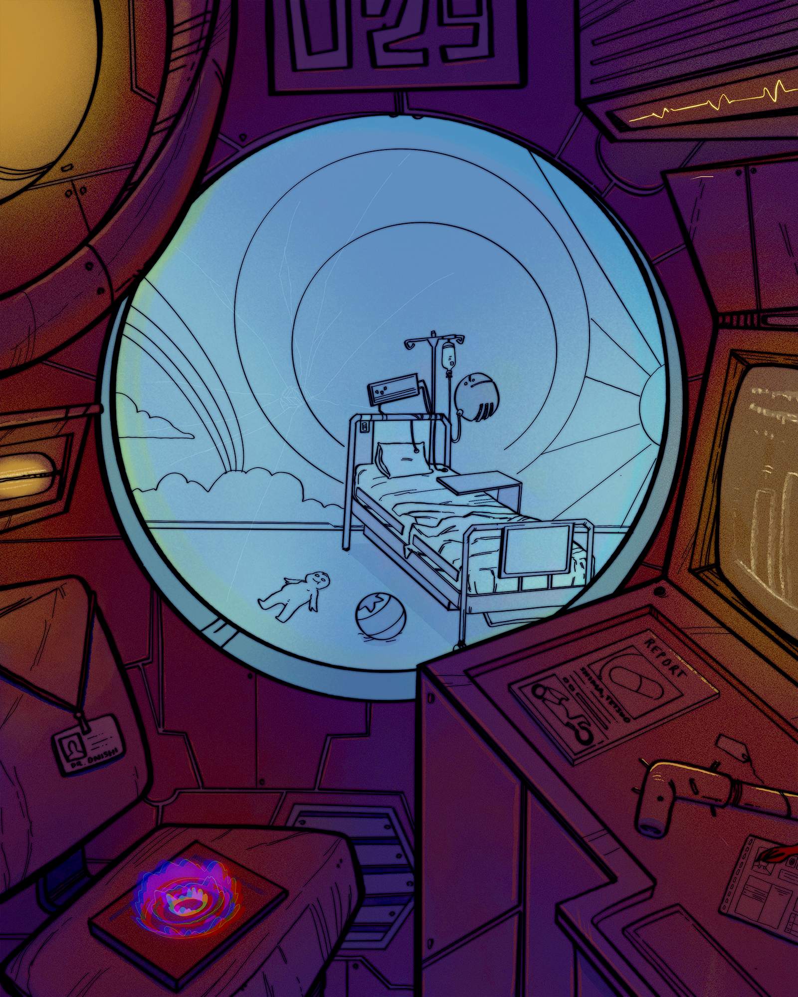
A fun brief looking at exploring narrative genres, figuring out their unique aspects and combining the genre markers. I chose to mixup kids lit with boxing and kaiju genres - creating this cute, bright little setting grounded in the real space of Calgary. Using several elements across multiple images helped tied them together despite the disparate nature of each image: atmospheric, interior, exterior and transport.
Environment Design: Genre Flip
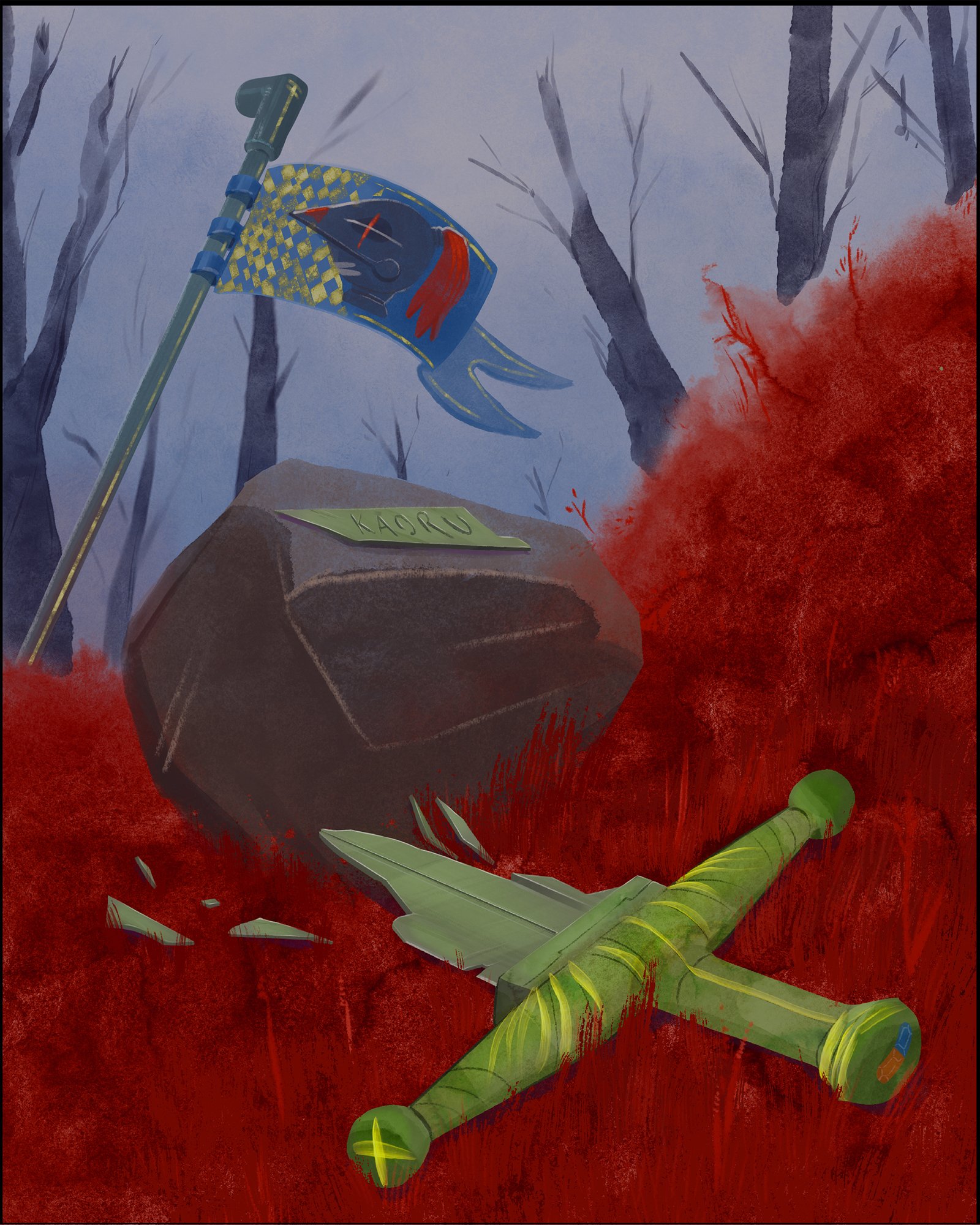
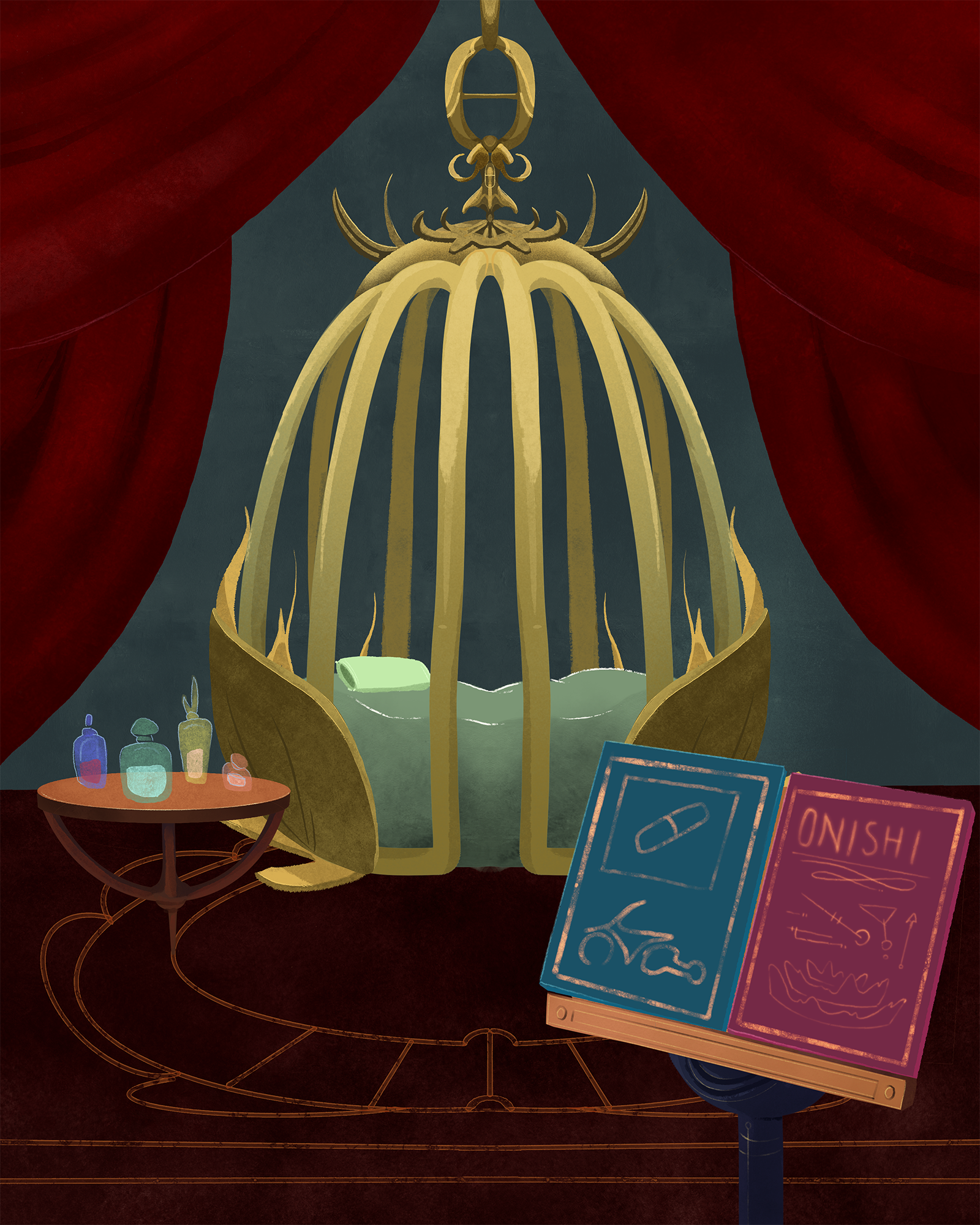
This project entailed producing four illustrations: two in a setting original to the narrative, and two transposing the same narrative moments into an entirely different genre. I was interested in creating a very large shift - so I chose to take Katsuhiro Otomo’s first volume of Akira, and flip two important moments in Tetsuo’s journey into a fantasy world of dark whimsy.
Pulling the colour palette from the animated movie, I kept the same desaturated green for Tetsuo’s smashed bike and changed it into a shattered sword. I also referenced the pill, the pipe and the mindscan, as well as the clown gang.
Figure Illustration: Magazine Cover
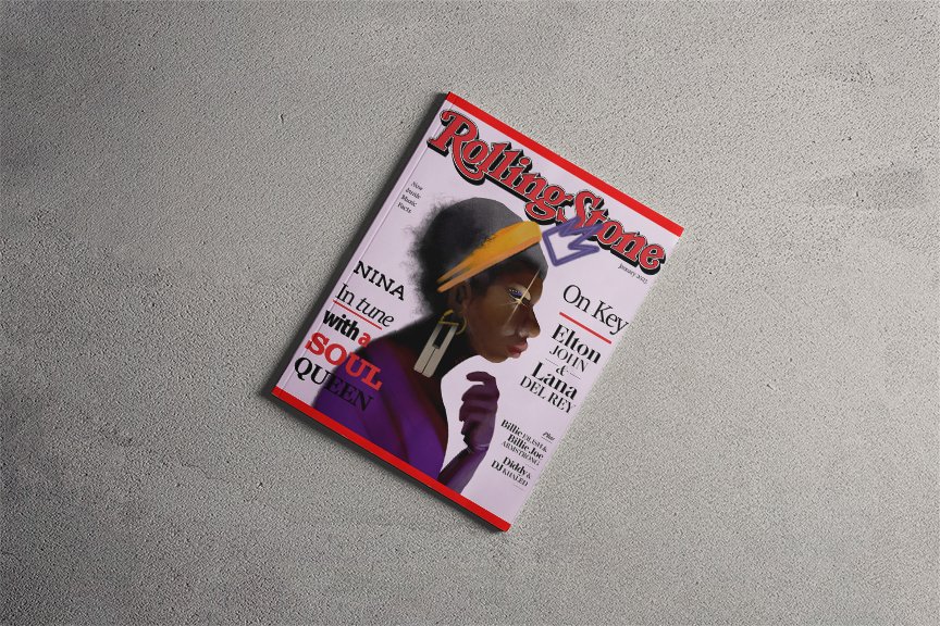
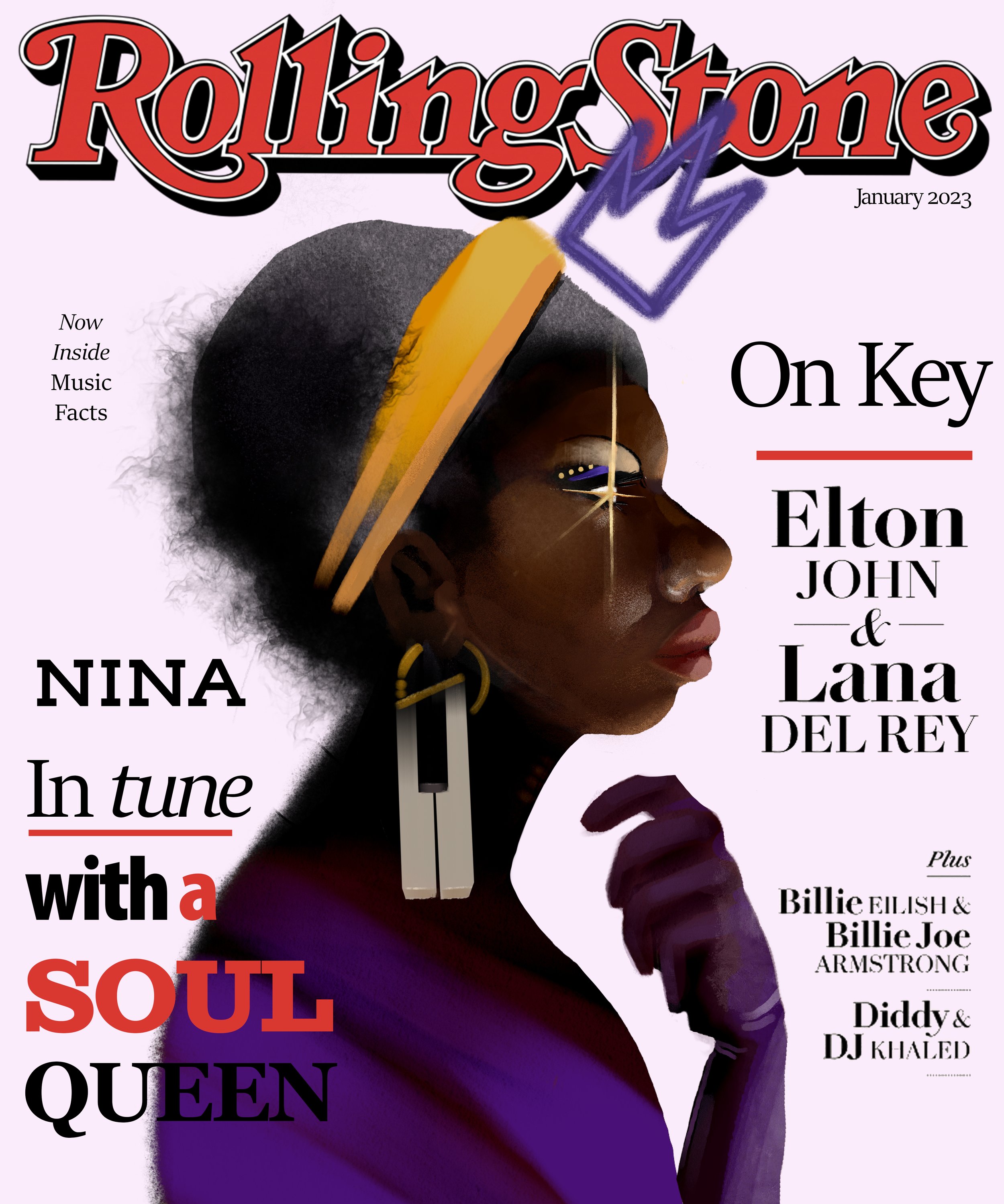
It isn’t every day you get to mockup a magazine cover - but when given this project I chose to illustrate Nina Simone on the cover of a faux Rolling Stones. Why? Well, she is not usually considered an conventional beauty by societal standards, but her impact has been powerful. I wanted to approach her with the same gravitas other, male, artists of colour are afforded. I decided quickly that it was more important that her portrait be striking than humorous, lighthearted or cute - as some magazine cover portraits are. I wanted it to be clear that the intention of highlighting her features was admiration. I also chose to highlight her with purple and golds - to accentuate her skin, to allude to royalty and to reference her classic association with lilacs and wine. I also chose to use a fuzz effect brush in areas of her hair, to connect to the lyrics of ‘Four Women’. The outcome is a character study that references royal portraits, lit for dramatic effect, connecting Nina to the mythic.
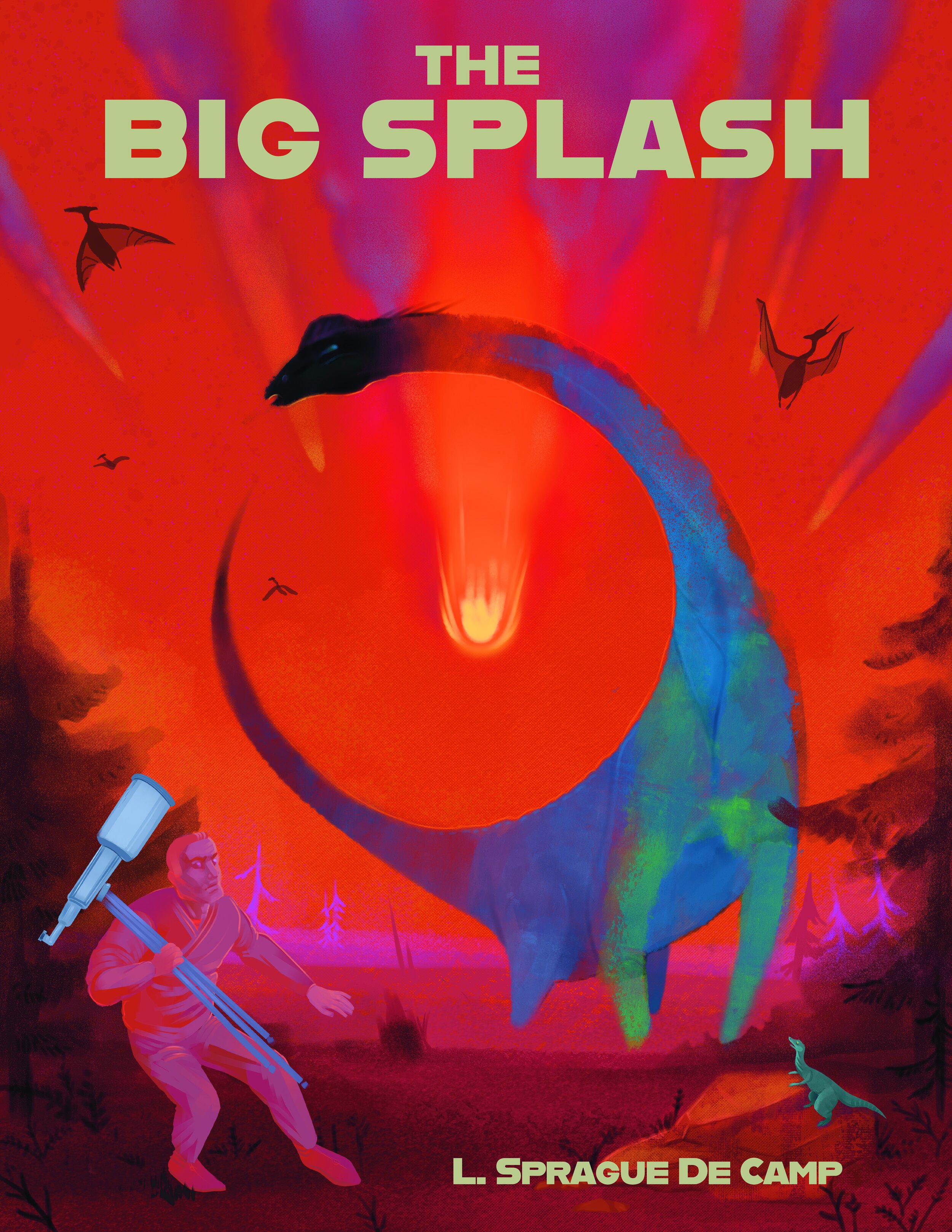
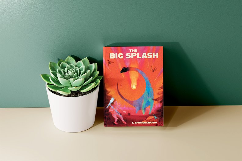
Figure Illustration: Pulp Book Cover
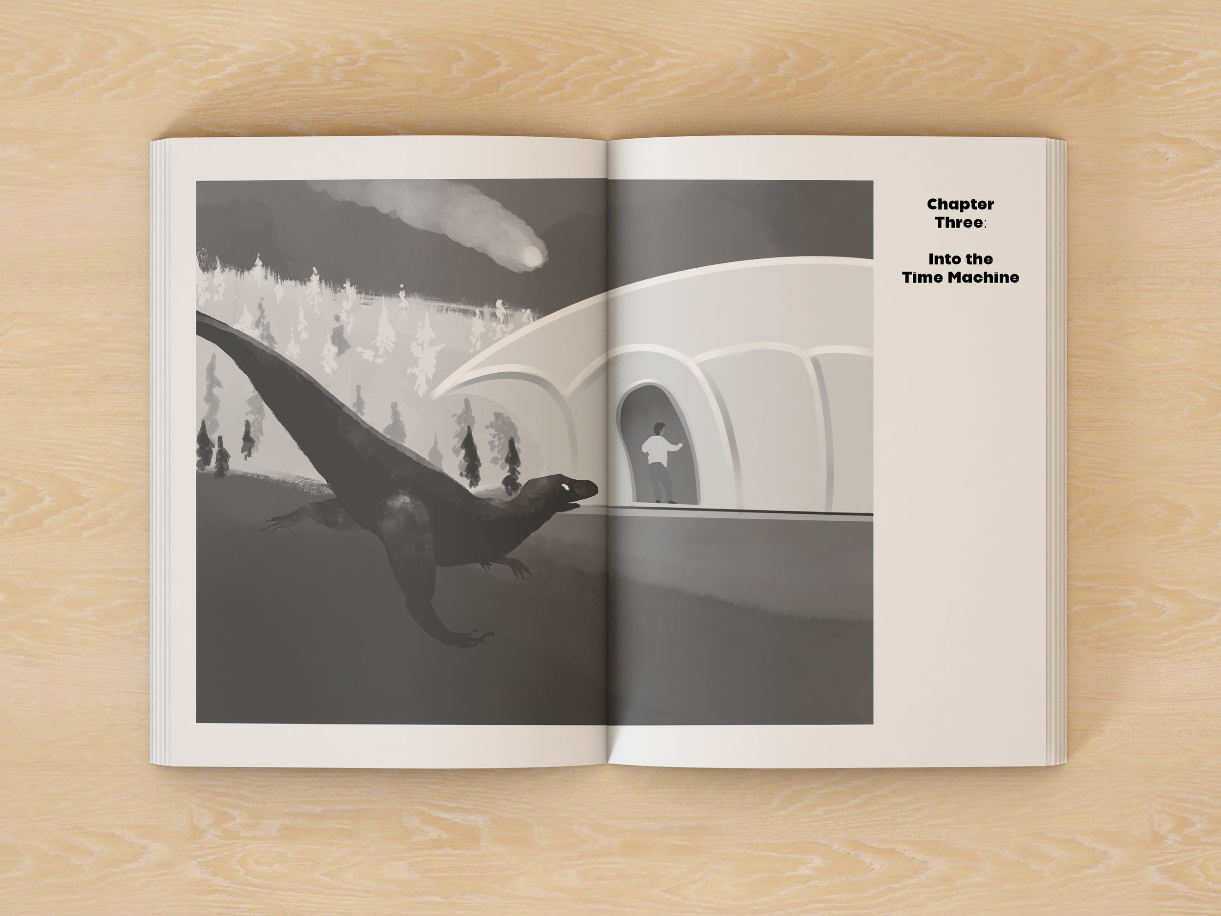
Don’t threaten me with a dinosaur-ing good time! When I was given the brief to illustrate a pulp fiction narrative (one cover, one interior) I jumped at giving L. Sprague De Camp’s ‘The Big Splash’ the treatment I always thought it deserved. I was looking to create an impactful, compelling cover illustration that caught the eye while signalling genre, connecting to the narrative and highlighting important figures. To get to that point, I researched a lot of time-travel and dinosaur pulp illustration, where I discovered a long history of compositionally strong, very bright covers. As it’s an extinction narrative, I chose to paint the human figure in the same hues as the environment, as opposed to the dinosaurs which no longer belong to the space. As De Camp’s narrative is family-friendly, I chose to work in an all-ages space, and the black & white interior illustration rough reflects that.
Narrative Time
the cross over space between illustration and time is often where I am happiest - and where we can convey the most complete information. In this small project I explore the maturation of a puppy across the hours and years.


