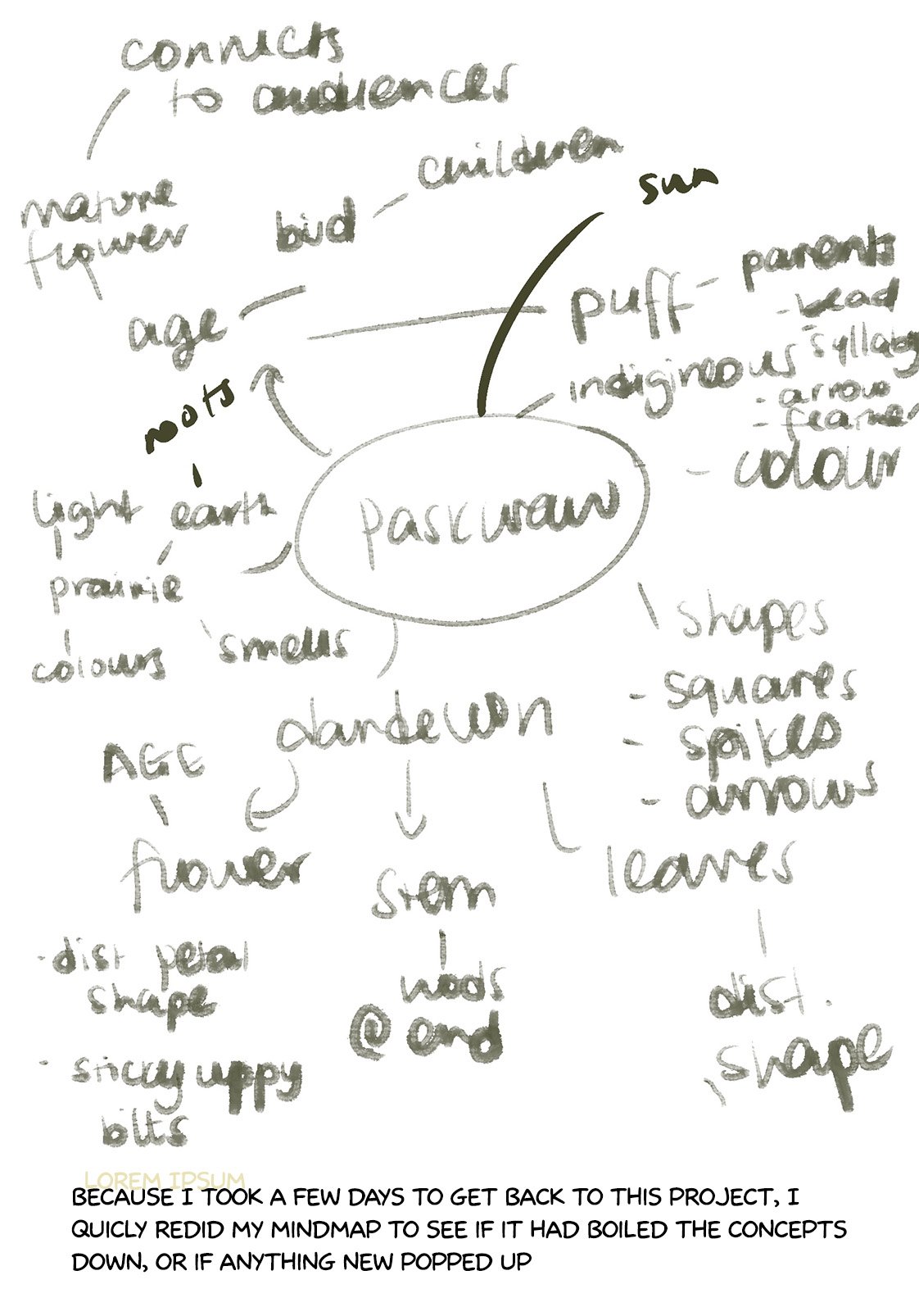
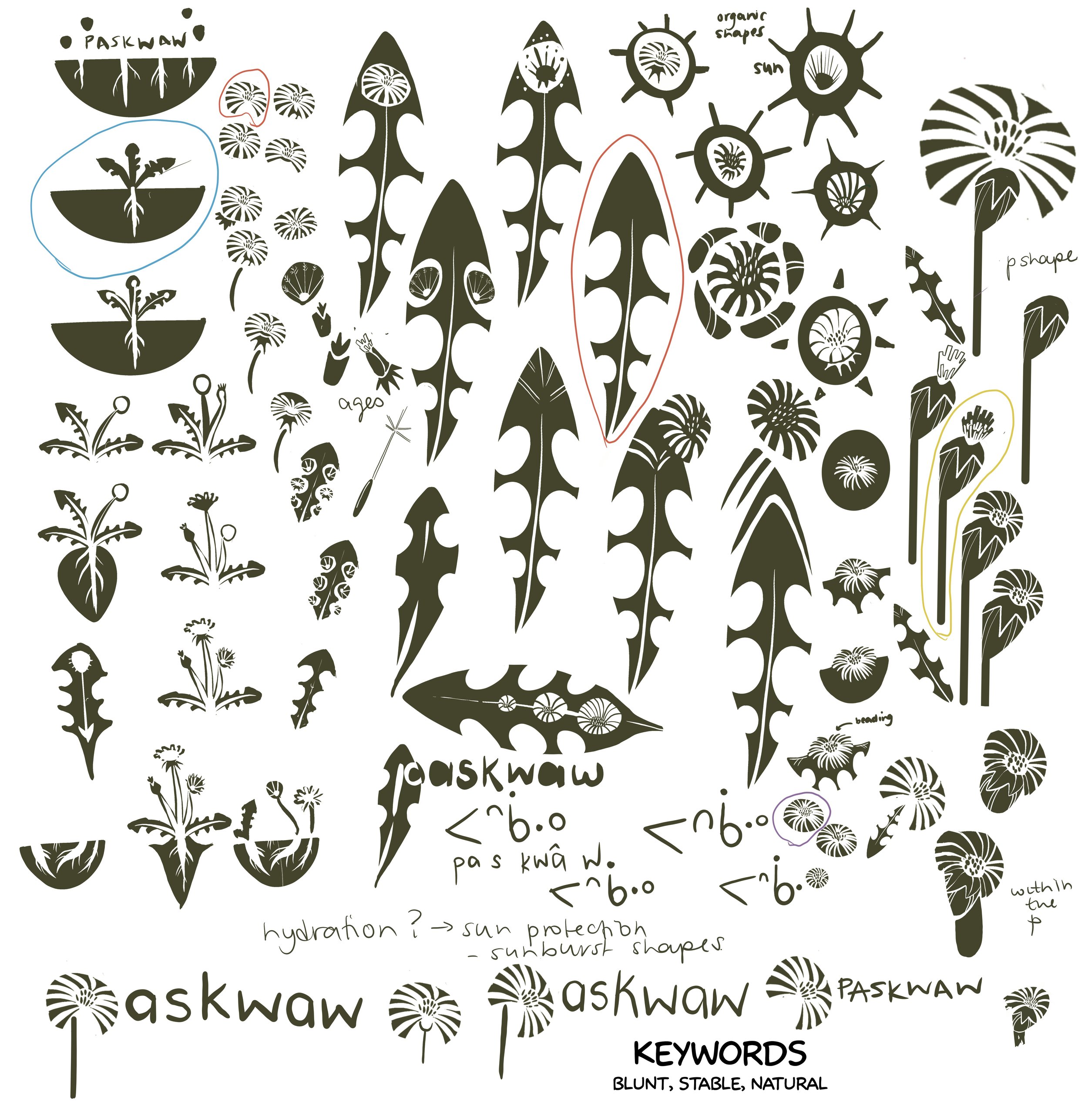
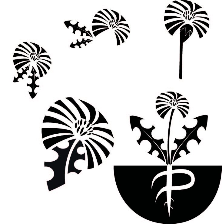
Koskwâwâtahkamikan, Okâwîm, or Described, In the Words of Her Mother
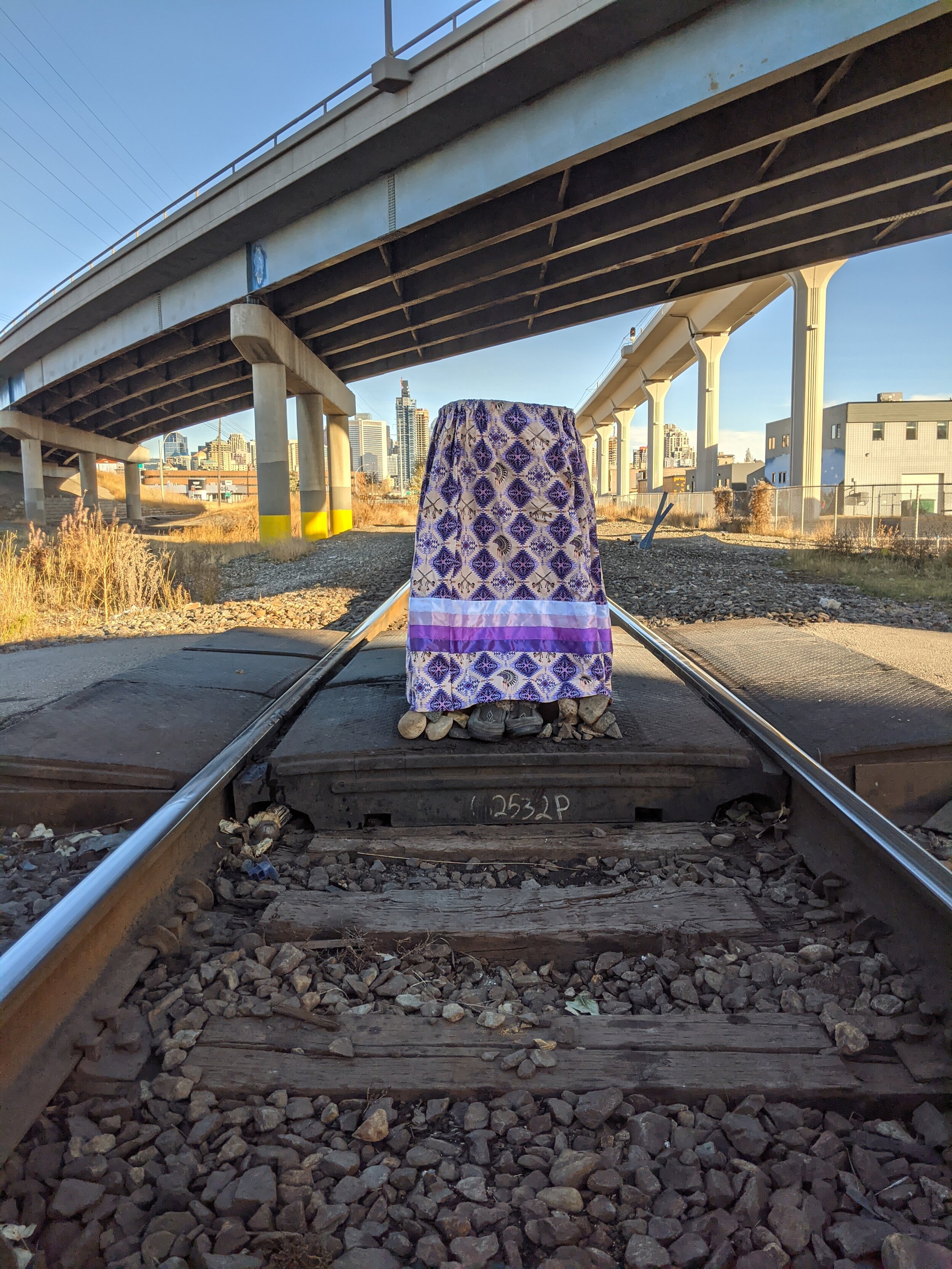

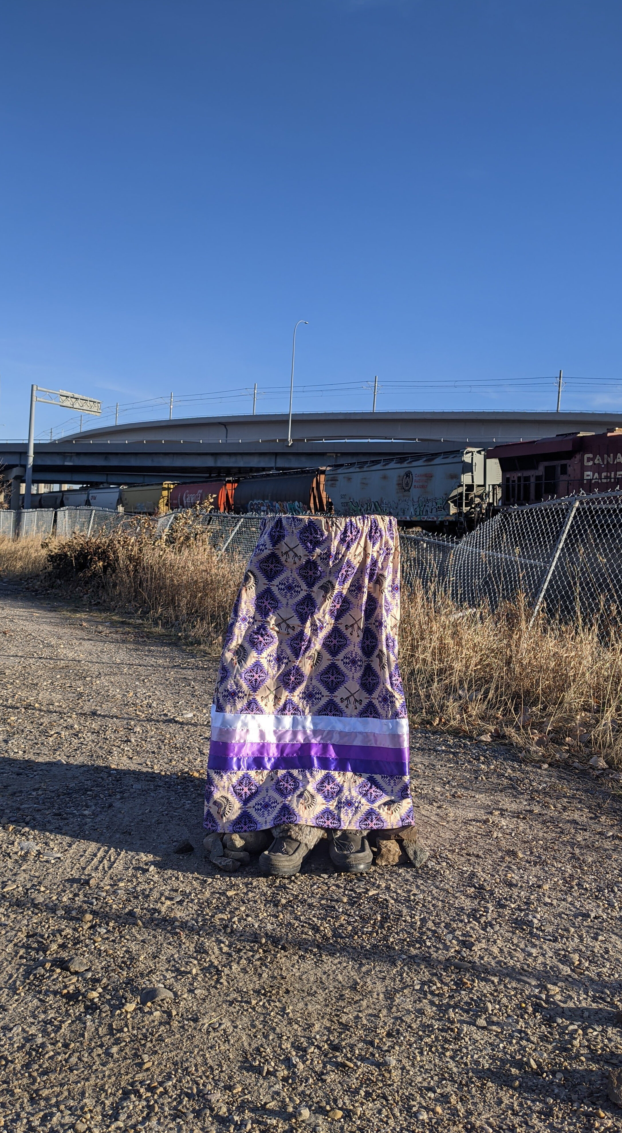
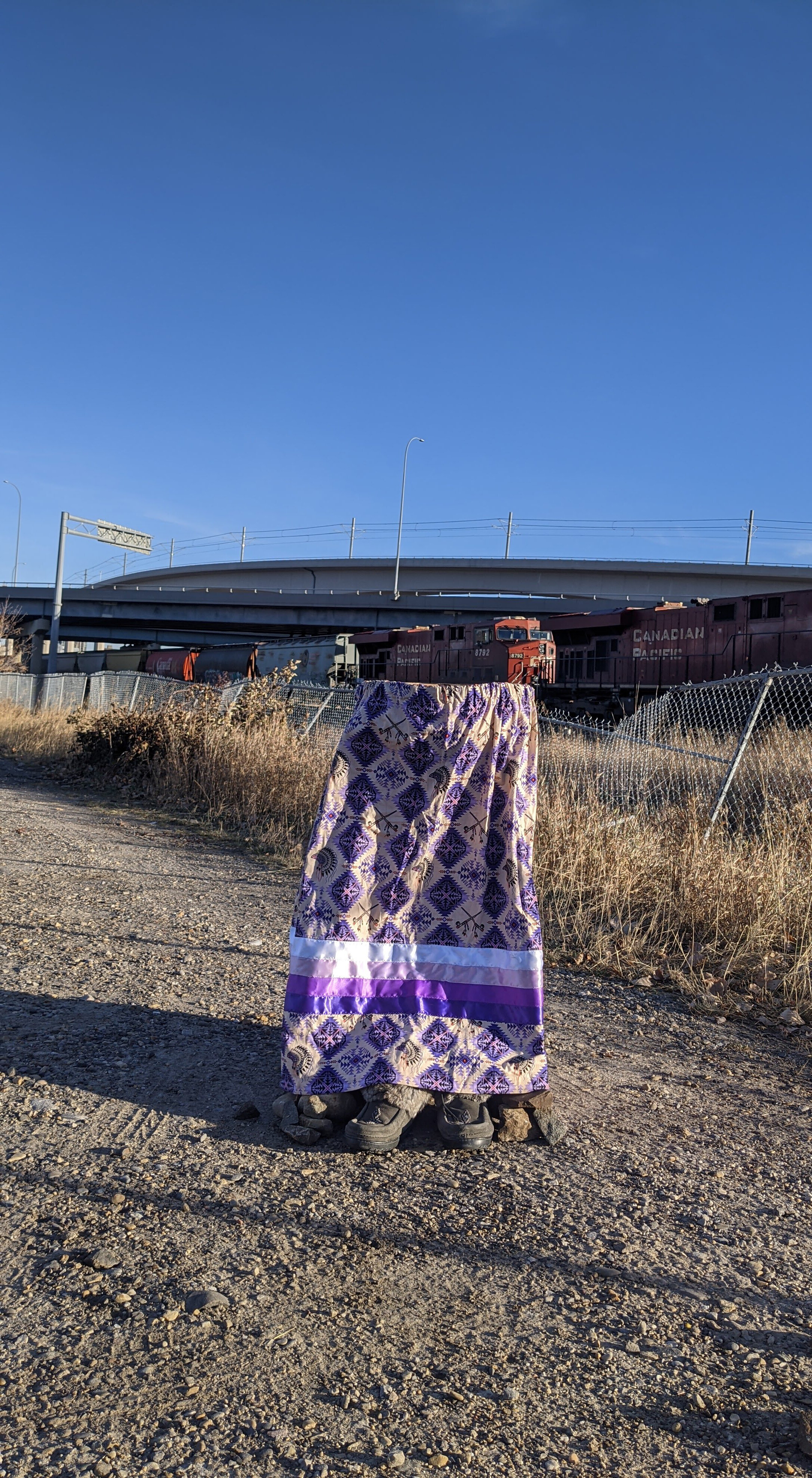
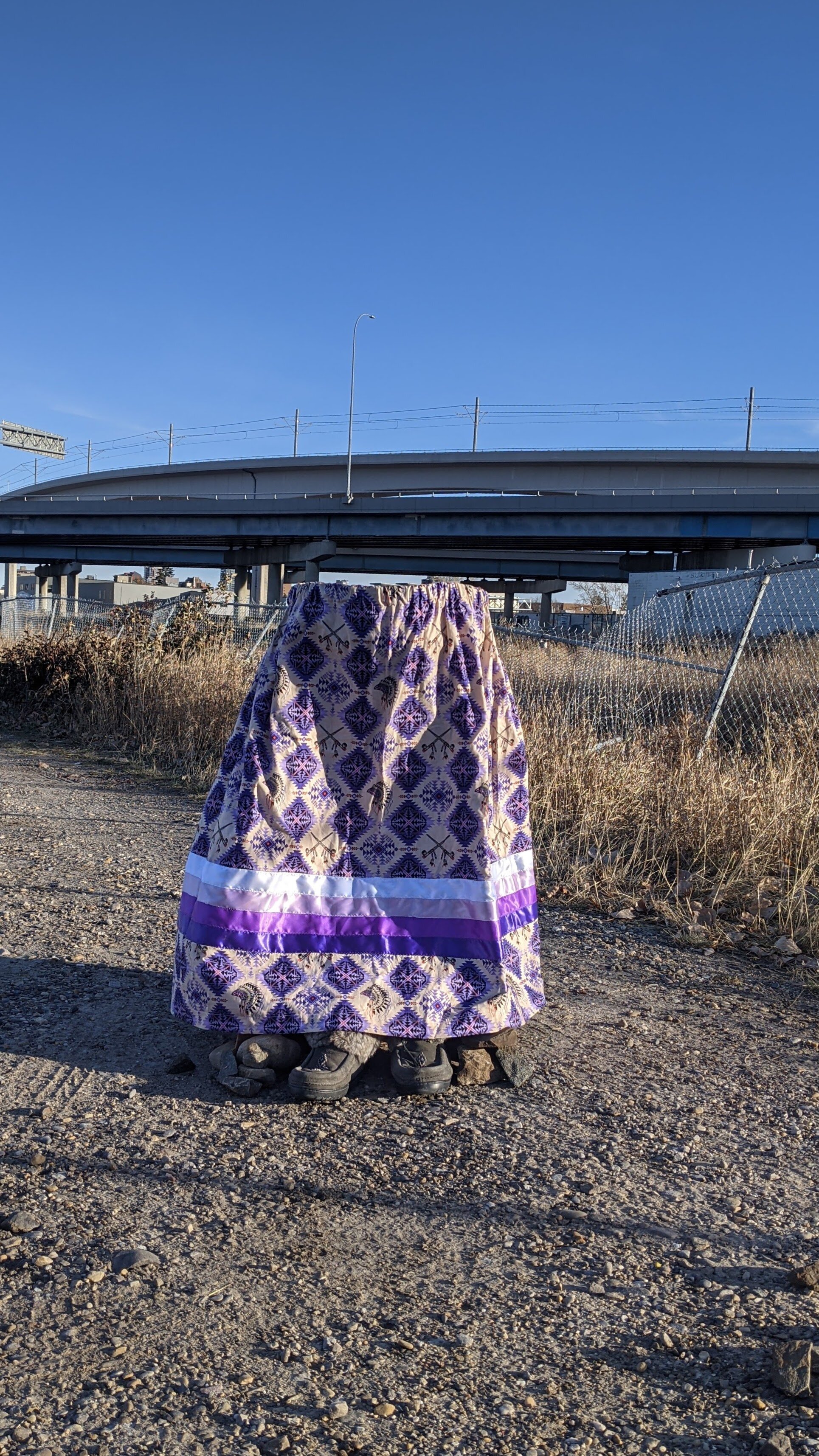

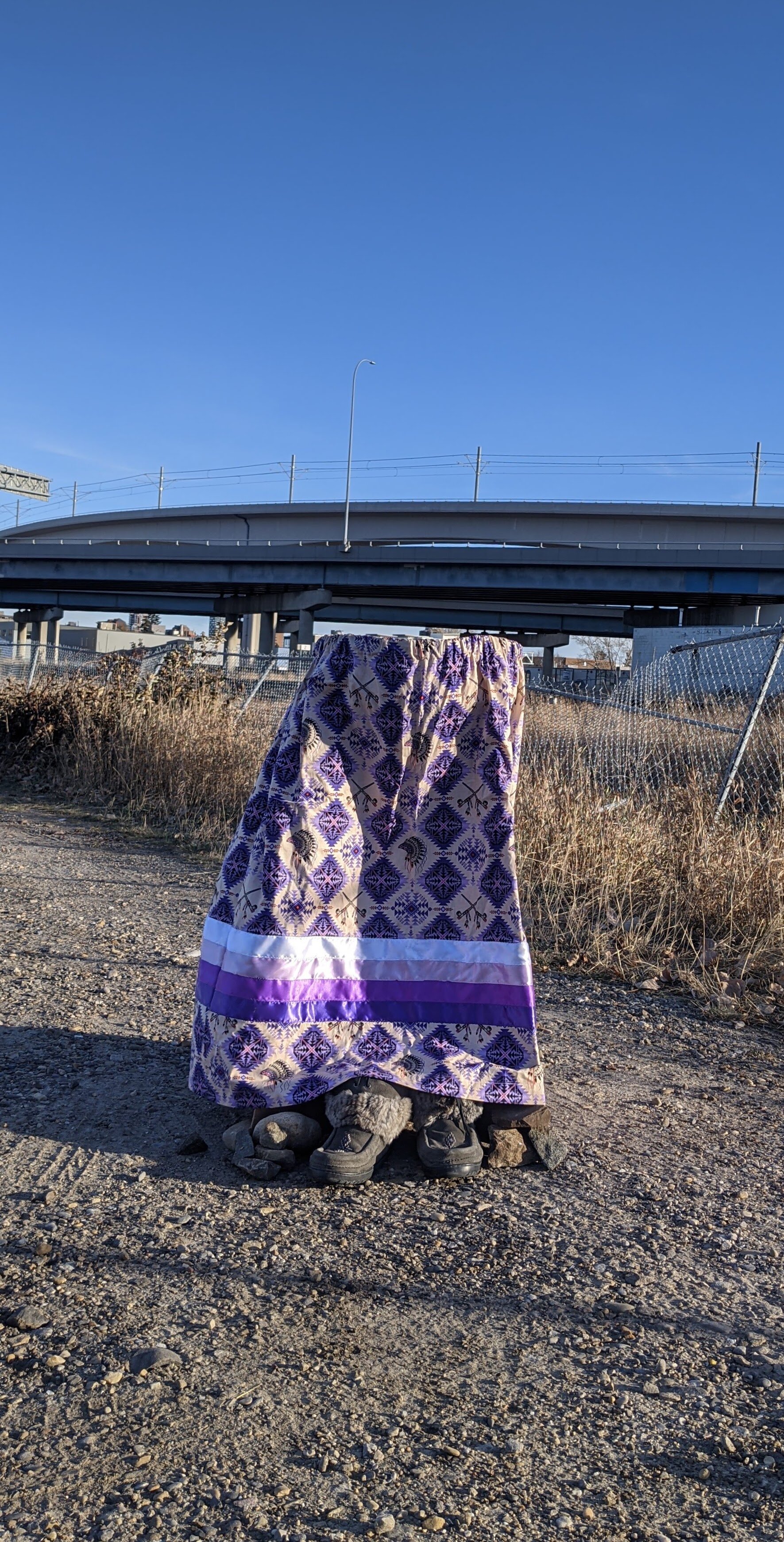
This sculpture was created as a student project by Jillian Dolan in Fall 2020. Made from chipboard, and moccasins and a sacred ribbon skirt, it is a site-specific response to a carpark near downtown Calgary at sunset. The implied figure is bisected by aspects of the landscape– the train and the bridges. This invites questions about the relationship of the represented (historical/contemporary indigeneity, woman/femmehood, the sacred), the setting (contemporary industrial spaces, industrialized transport, modern wasteland, urban liminal spaces) and the viewer. There are aspects of the natural – the sky, the dead grass, the unpaved dirt, overpowered and oppressed by unnatural concrete and metal forms. The train passes through, something the sculpture cannot do, progressing time. The skirt interacts with the wind imparting motion although the sculpture is stable.
Industrial areas/transportation corridors, including rail tracks, are examples of areas in which missing and murdered indigenous people are killed and/or their bodies abandoned. Urban colonized settings erase indigenous people and their ceremonies, rendering invisible the contemporary indigenous body/experience, are the location of colonized power and are mentally, physically and emotionally harmful to indigenous people.
If all bodies exist in space and time, to paraphrase Lessing, then statistically it’s inevitable a harmed indigenous body has inhabited this location, both in the past and in the future. If the sculpture were to have been left in place, it would have faded and deteriorated – a parallel to the decline of settler-indigenous relations and the changes clothes on a corpse experience. In a gallery this sculpture might have commented on some of the previous mentioned aspects, but it would not have experienced this setting, or asked the viewer to consider it in this setting, a place that is dangerous to both the material nature of the sculpture and to the represented.
Indigenous people who come into these spaces risk ending up being referred to as the title, which paraphrases the many MMIWG2S newspaper articles and obituaries this city has seen over the years, and the first person accounts spoken by grieving mothers. This figure has been, and will in the future be, described by a mother to a reporter, or friend, or national inquiry. There has been a decision to decline translating the Nēhiyawēwin title (although it is translatable by dictionary) because the language barrier encapsulates the outsider disconnect and unnatural relationship that non-Indigenous people must have with this work.
The plinthlike site-sourced rocks are intentional in that they support against the elements but also in providing a separation of sculpture from viewer. This sculpture is not designed to be welcoming to the colonial gaze. As sacred objects, neither ribbon skirt or woman should be touched.
Re/Freshments
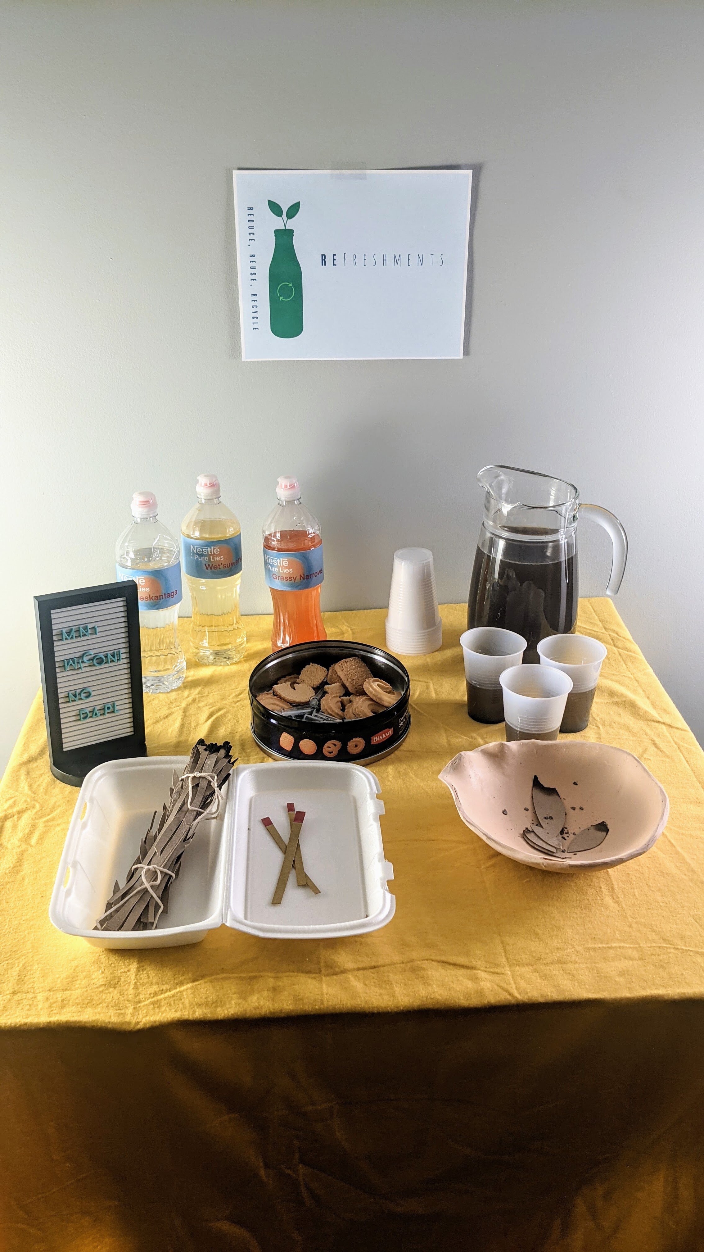

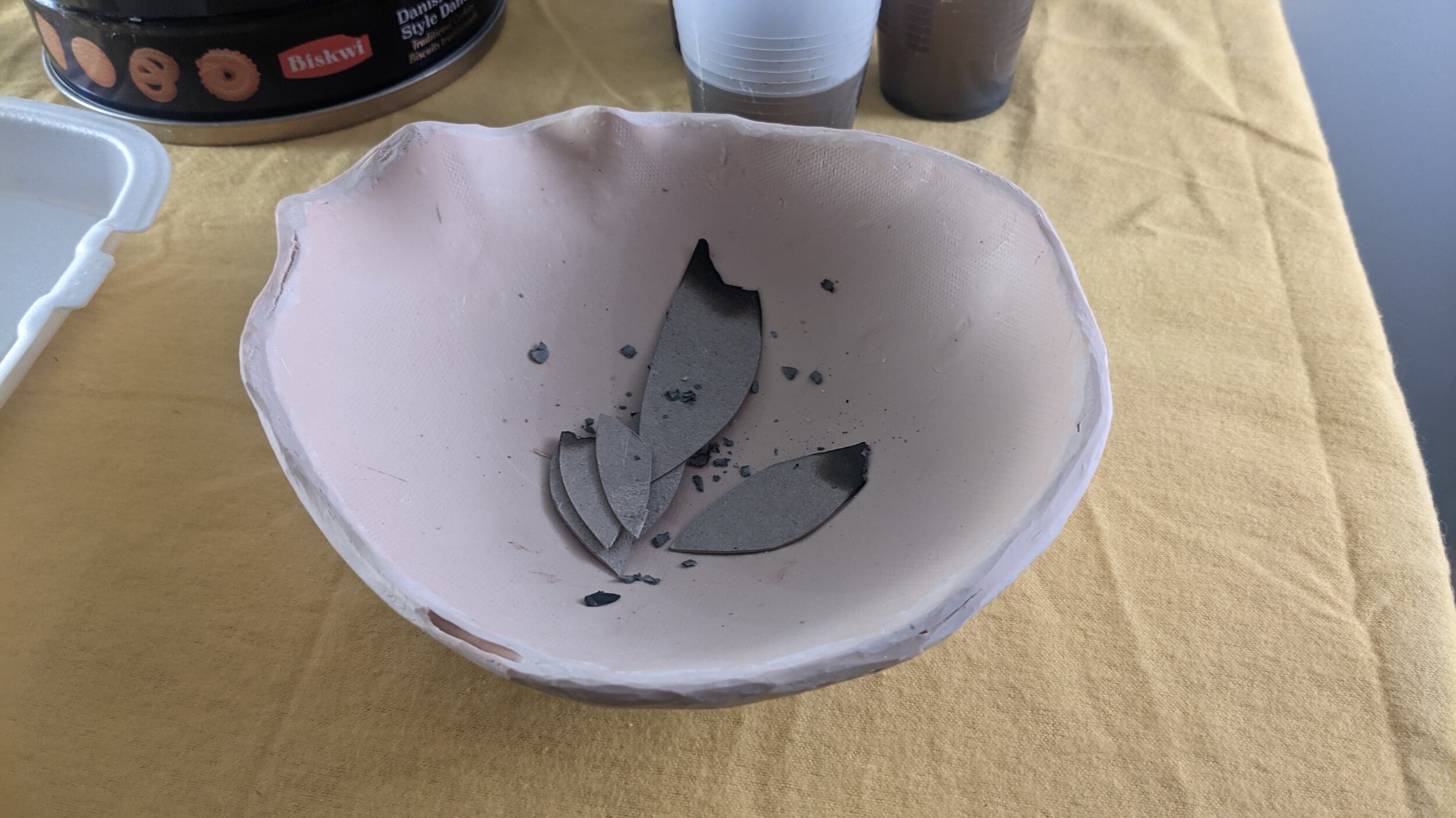

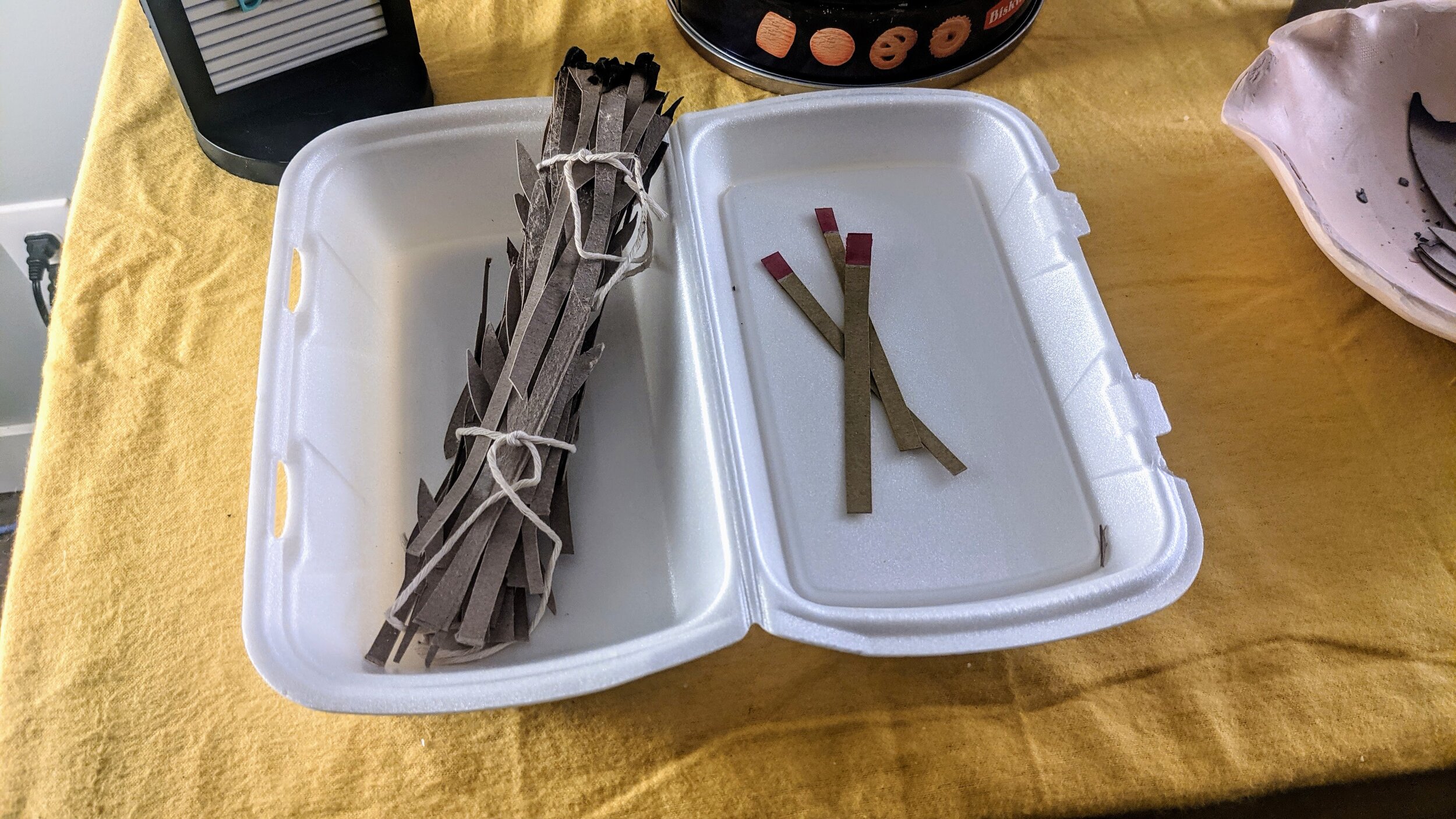
This sculpture was built for sharing – there was a strong intention to lean into the relational aesthetics aspect of a sculpture/ installation, making it somewhat unclear what was art and what was regular life. Refreshments served at a community hall, cultural gathering or art event are a common touch point – they involve food, people, relationships. It’s a comfortable place to stop for a moment and chat. The idea of food as art invites the spectator to weigh whether they dare to snack or not, and to discuss who in their group is brave enough to steal a cookie. This has a playful aspect. More importantly, there was an intention to relate the spectator to indigenous issues regarding food security, unsustainable diet, recycling and the clean water crisis that is ongoing for many communities. An important element is the inorganic oversized version of a smudge bundle produced using recycled or recyclable products. The smudge stick is cardboard cut to resemble sage, a spiritual resource and traditional medicine that is becoming inaccessible as settler people deplete stocks for their own, non-traditional use. Typically, one would light the smudge in a shell or fireproof alternative – instead a polymer clay bowl has been formed, and then carved it into an abstract form reminiscent of a shell but incapable of safely serving its purpose. The matches are also just cardboard and therefore unusable. Typically a smudge bundle resides in a meaningful pouch or container, but this one has been popped it in a used leftover container, which is a reference to quick fixes and the value of fast-culture. The choice to create an outsized non-functional smudge bundle speaks about who has power and tools to ‘fix’ the other problems denoted by the other items on the table. Viewers who approach it will have different understandings of it depending on their own backgrounds and it is important to facilitate that conversation.
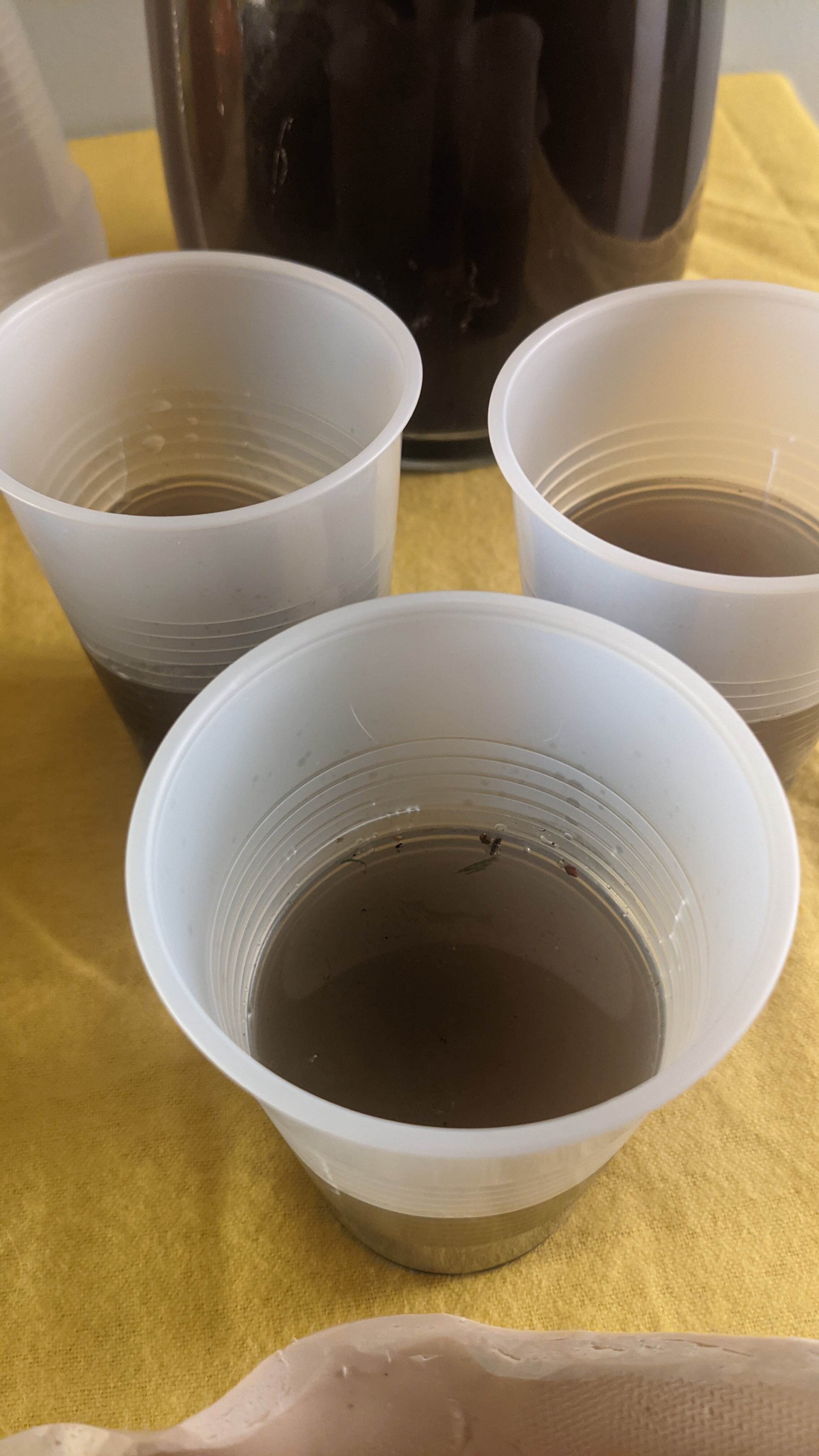
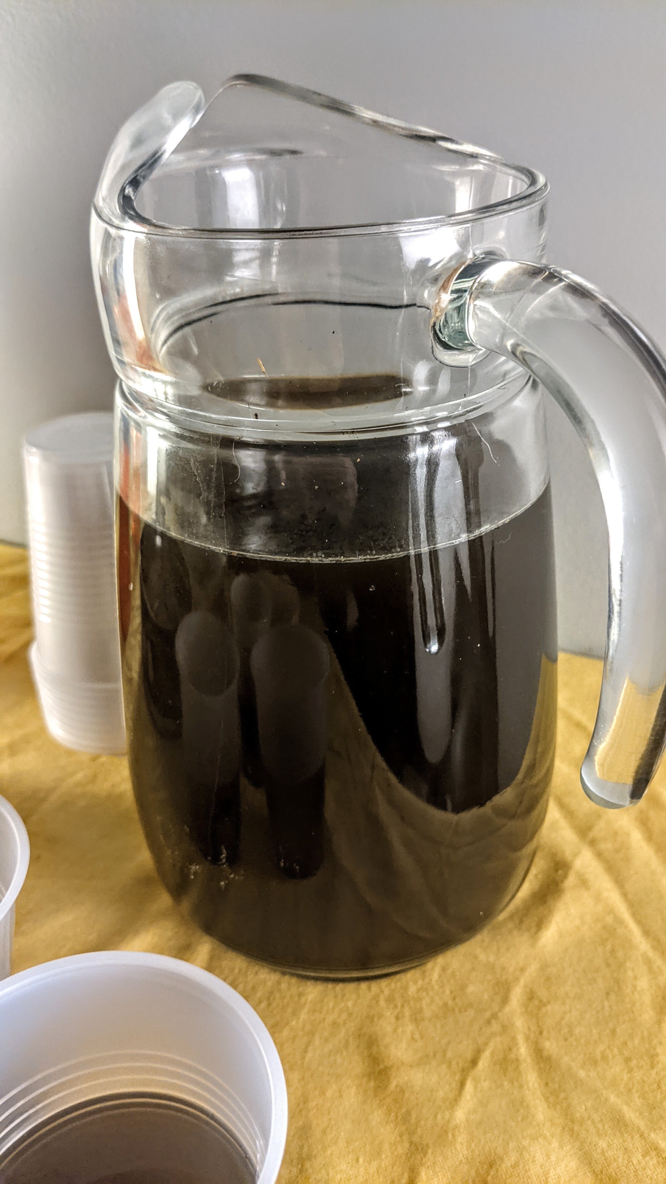
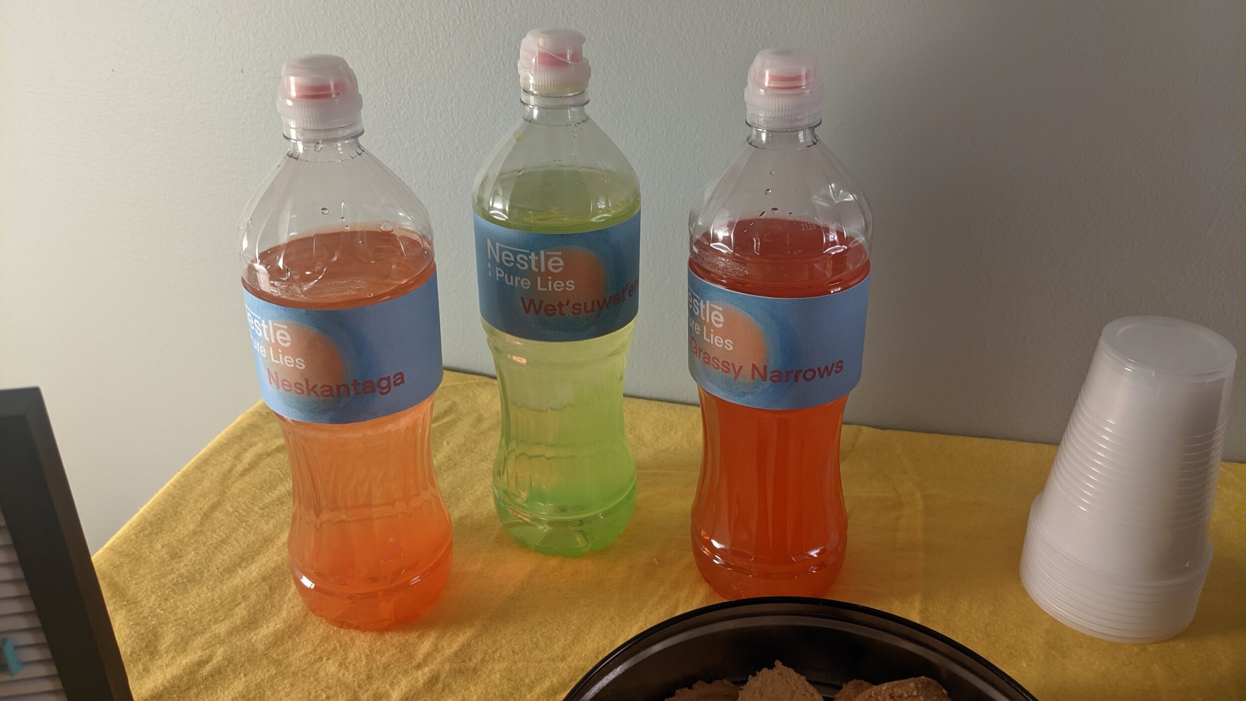
We scrubbed the oil stain from our parking pad with solvent (thanks, leaky truck and patient partner) and put the result in the water jug. You cannot smell it, but we still can. It was blindingly nasty. Paired with three water bottles, presipped and coloured with acrylic ink for a nice inorganic colour bloom, it accesses water issues. Labels were made digitally, based on the nestle pure life water labels, but referencing the corrupt nature of nestle’s water business, as well as names of three reserves with historical, horrific water issues that rendered their water unsafe to be used for anything but toilet flushing (it is also not uncommon for reserves to not have access to water even for toilets). The cookie tin is mostly filled with used syringes, but there are some leftover cookies. This refers to the imbalance of access to healthcare, nutrition appropriate for indigenous bodies, the prevalence of diabetes and cardiovascular disease due to an inability to metabolize western foods efficiently and food insecurity. Who gets the majority of the cookie tin is a big deal –nationally, about half of indigenous families struggle to put food on the table (Alberta is higher at 60% for indigenous families, vs only 8.4% of non-indigenous families experiencing this).
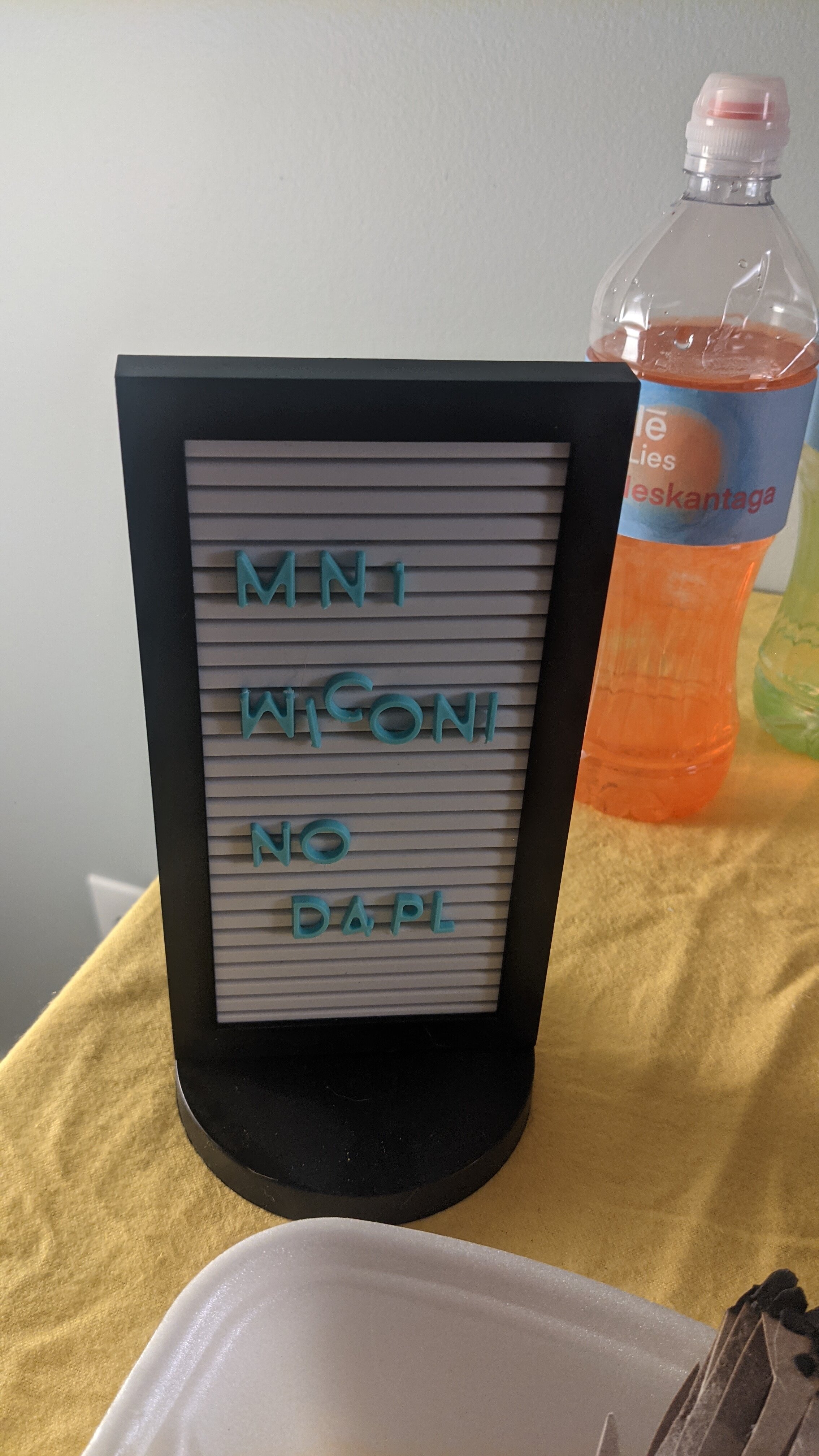
The Mni Wiconi No DAPL sign has been added to tie the whole work together. It is Lakota for ‘Water is Life’ (also meaning Water is Alive) and references the ongoing dispute #NoDAPL and the issues of indigenous sovereignty, broken treaties, abuse of sacred ground and the mobilization of militarized police and the army against peaceful (often smudging) protestors.
The title is based around the question, who gets first access to resources and who gets the recycled leftovers, as well as how refreshing it can be to reset something or get a fresh take. Also we should all probably recycle more.
Apex Predator
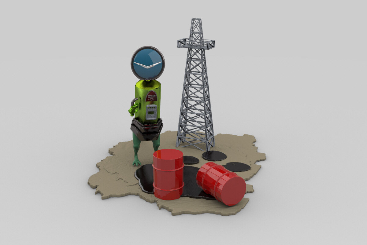


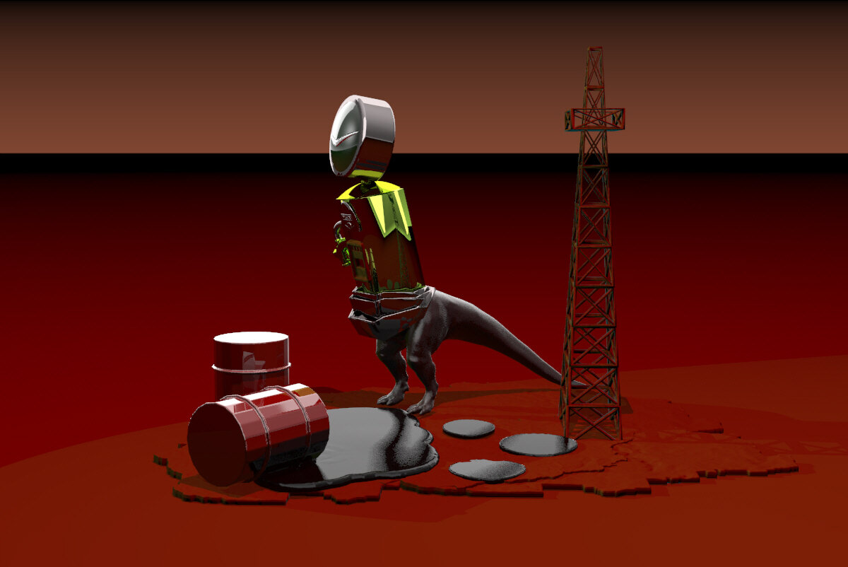
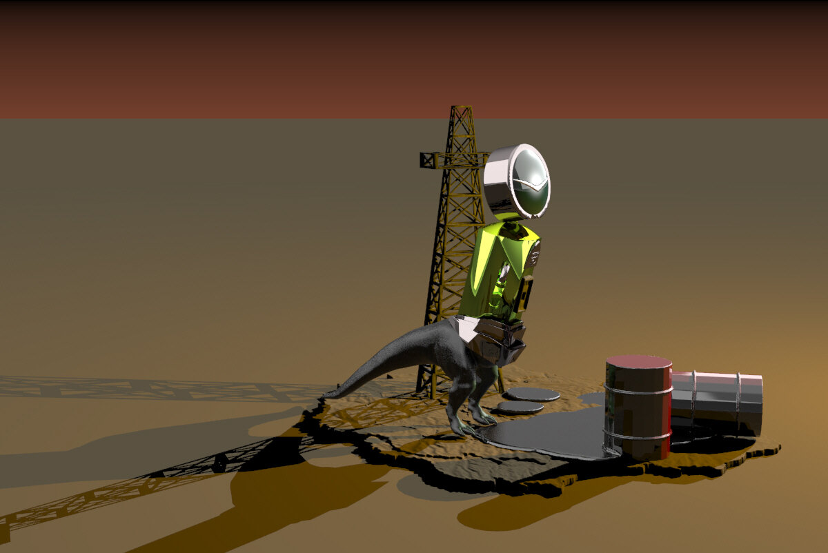

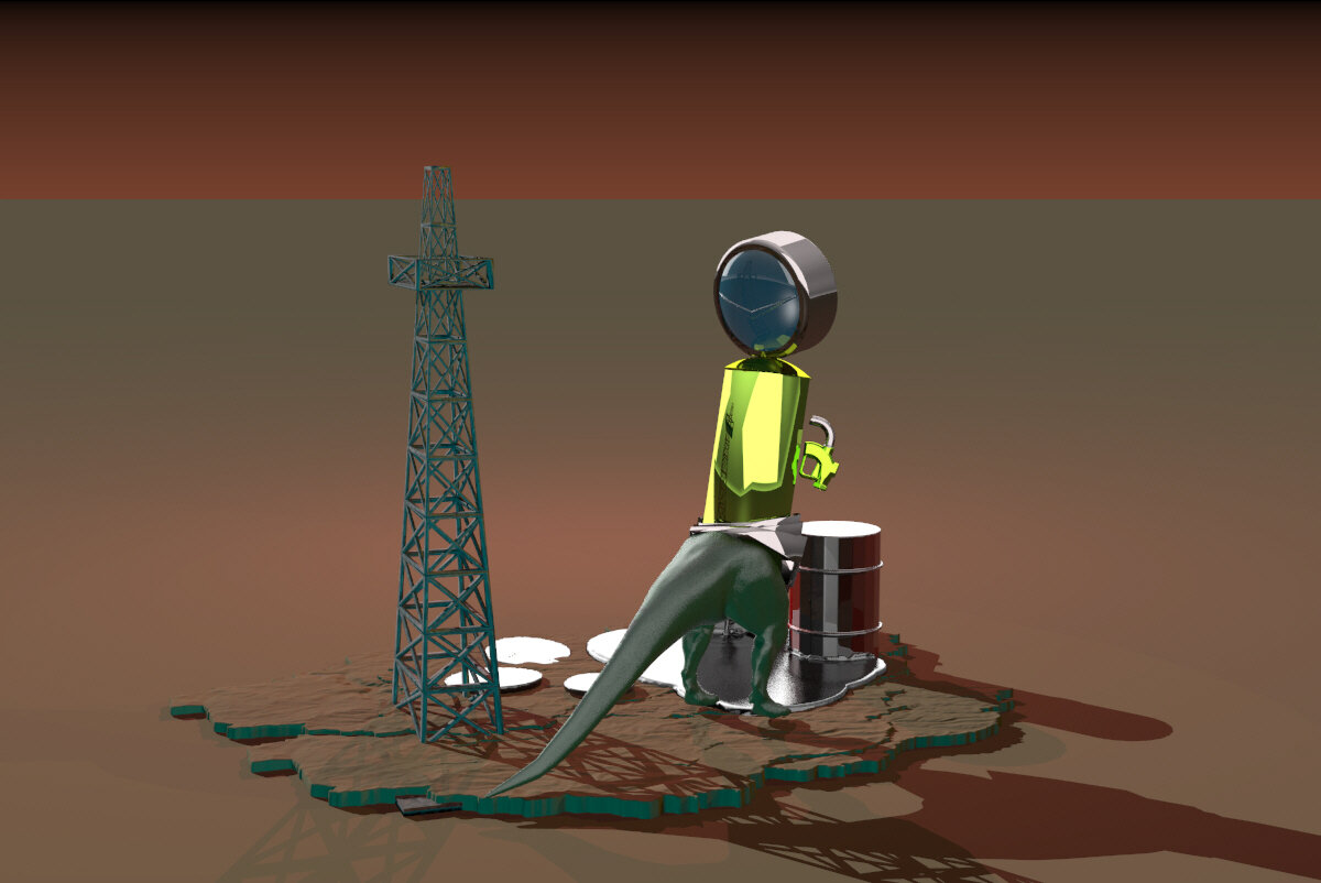
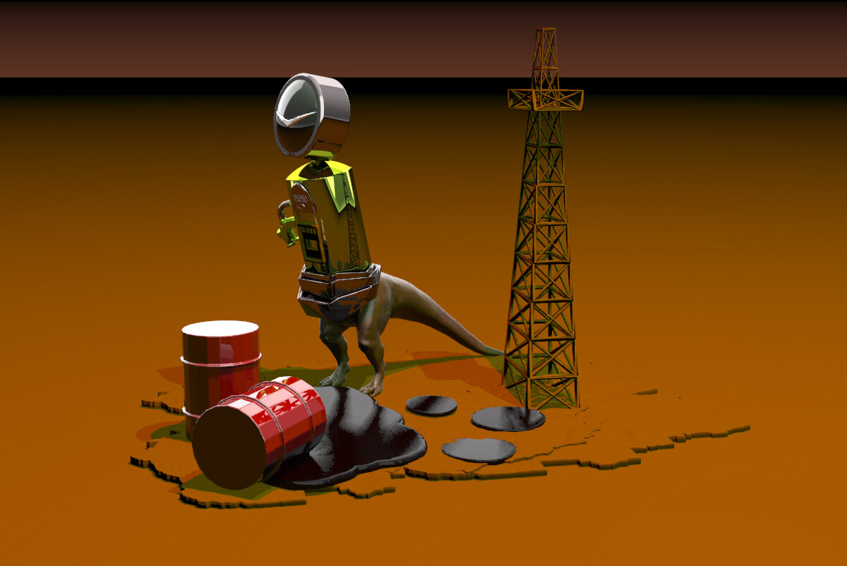
Apex Predator is a curious beast. Built from parts sourced from thingiverse, modelled originally in tinkercad and meshmixer, it was rendered finally in Rhino6. A juxtaposition of source and resource, ancient and modern, problems and solutions, this CAD sculpture references oil, antiquities, predators and prey. The head of the beast/bot harkens to car brand symbols and watch faces. The ominous glow of the background lighting reminds us that every Apex Predator eventually comes up against an extinction event that they cannot outmuscle. Is Apex Predator an accurate descriptor or a title designed to poke fun at oil economics? That would depend on the viewer’s relationship to the resource.
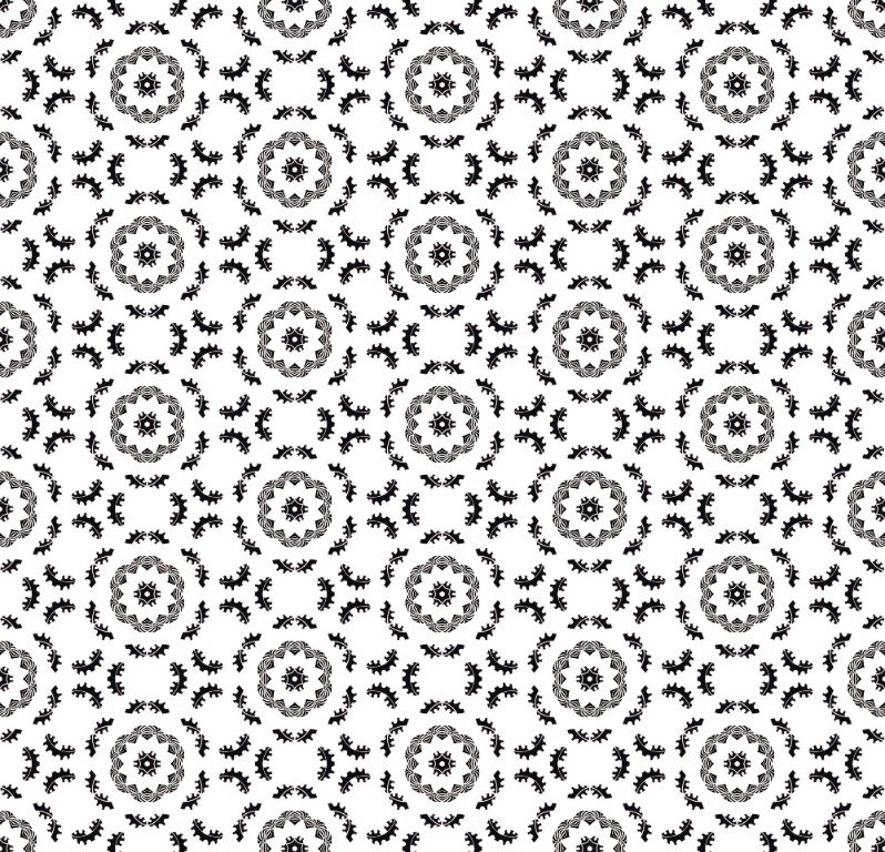
Lasercut Patterning

As I continue exploring and expanding my practice, it’s natural to flow between 2D and 3D spaces. Here, a 2D pattern was created in Rhino7, exploring an intersection of European Gothic and Indigenous shapes/ designs. Once modelling was complete, the pattern was etched and cut into balsa wood with a laser.
Rendering the Real: Light
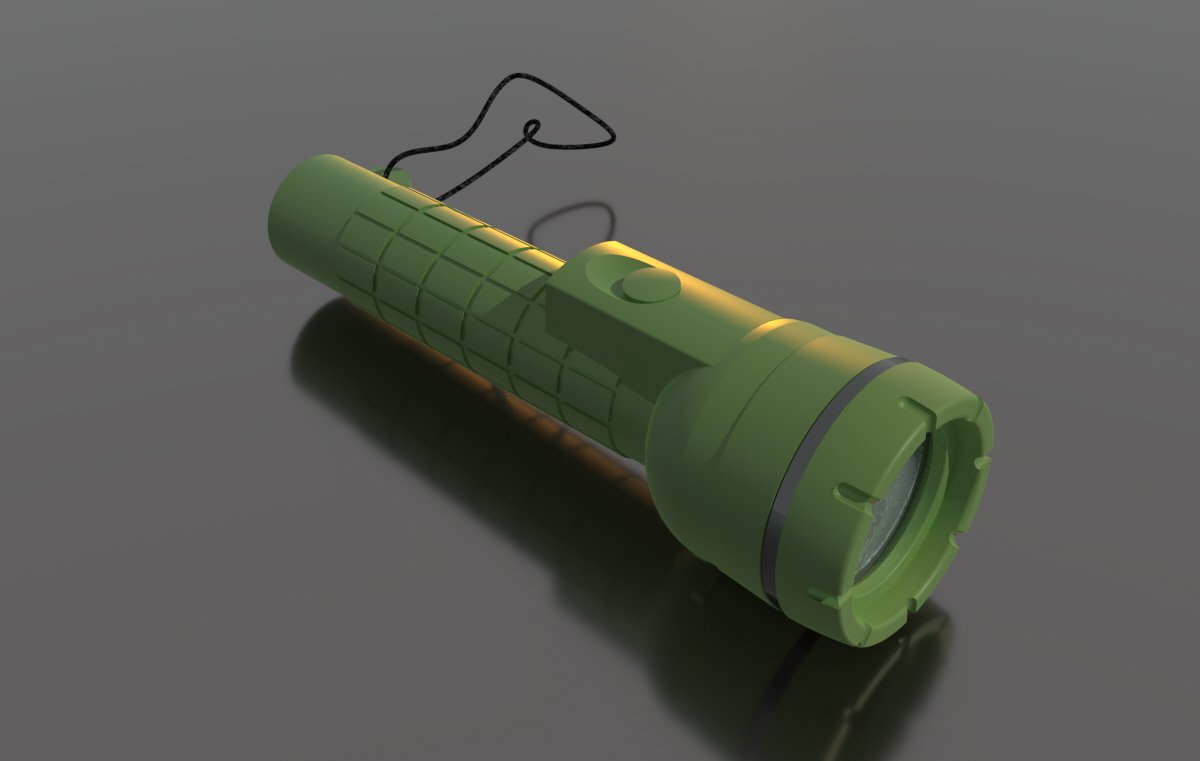


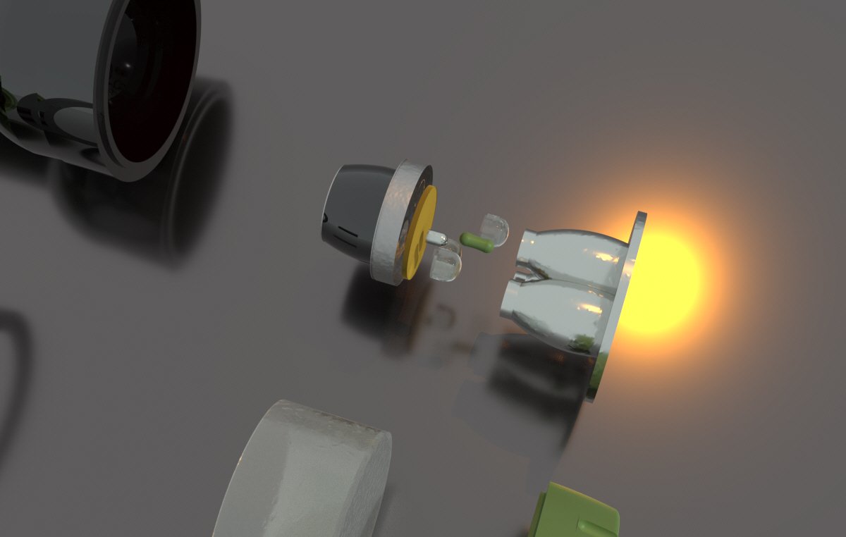
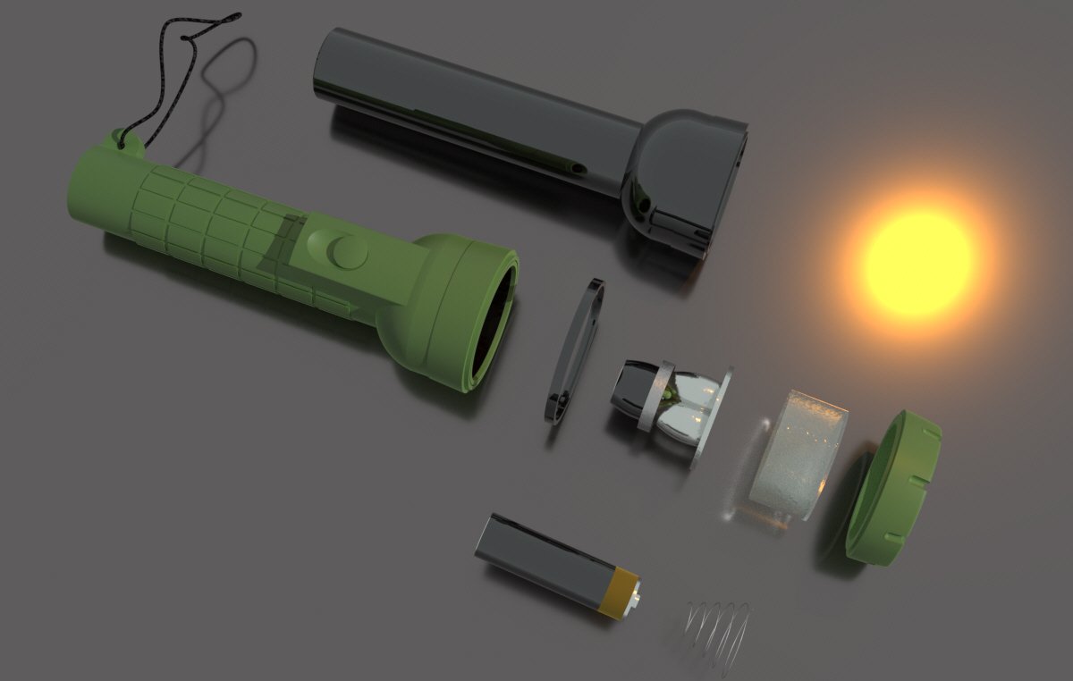
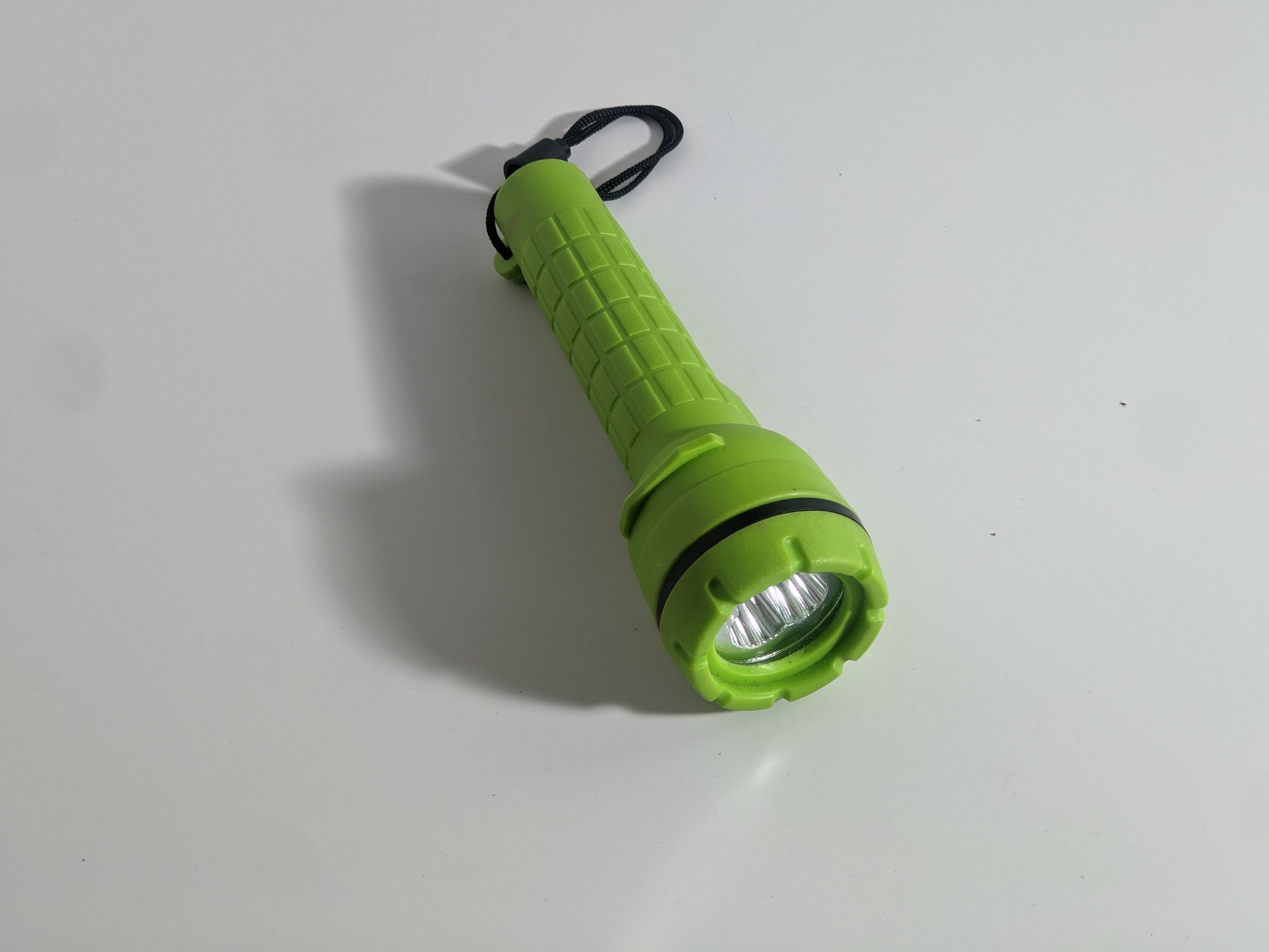
In an effort to continue learning spatial thinking, I completed this project, in which a tangible item (a flashlight) was taken apart and recreated in Rhino7 and rendered. I find continued learning immensely valuable - and as an illustrator I believe learning to think in 3 or more dimensions only improves my capabilities. This item was chosen for it’s physical properties, but also it’s symbolism. Each component was measured with calipers for accuracy, and technical drawings were created. These drawings informed the recreation process, which was largely successful and ended with the renderings seen above.
Moisturizer Packaging Design
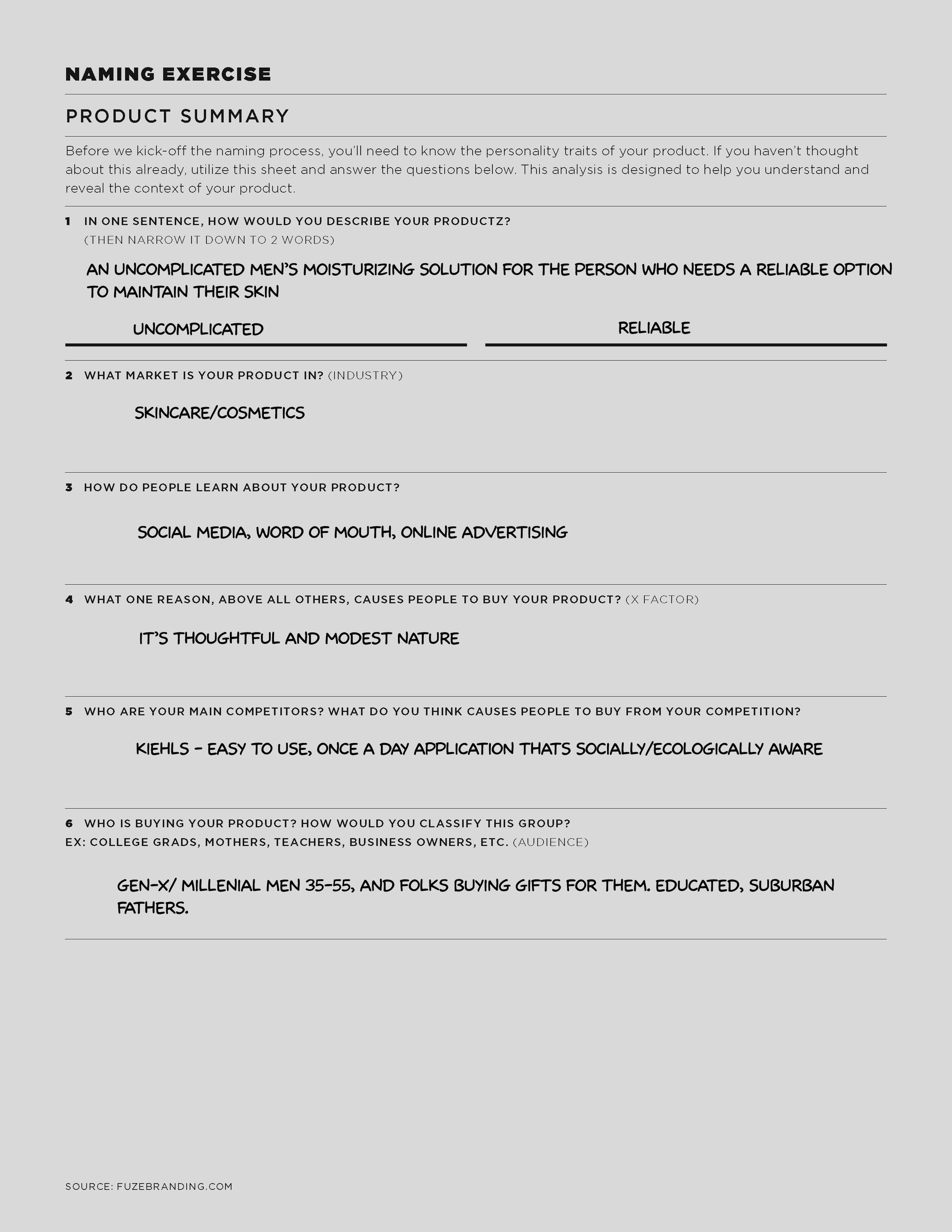
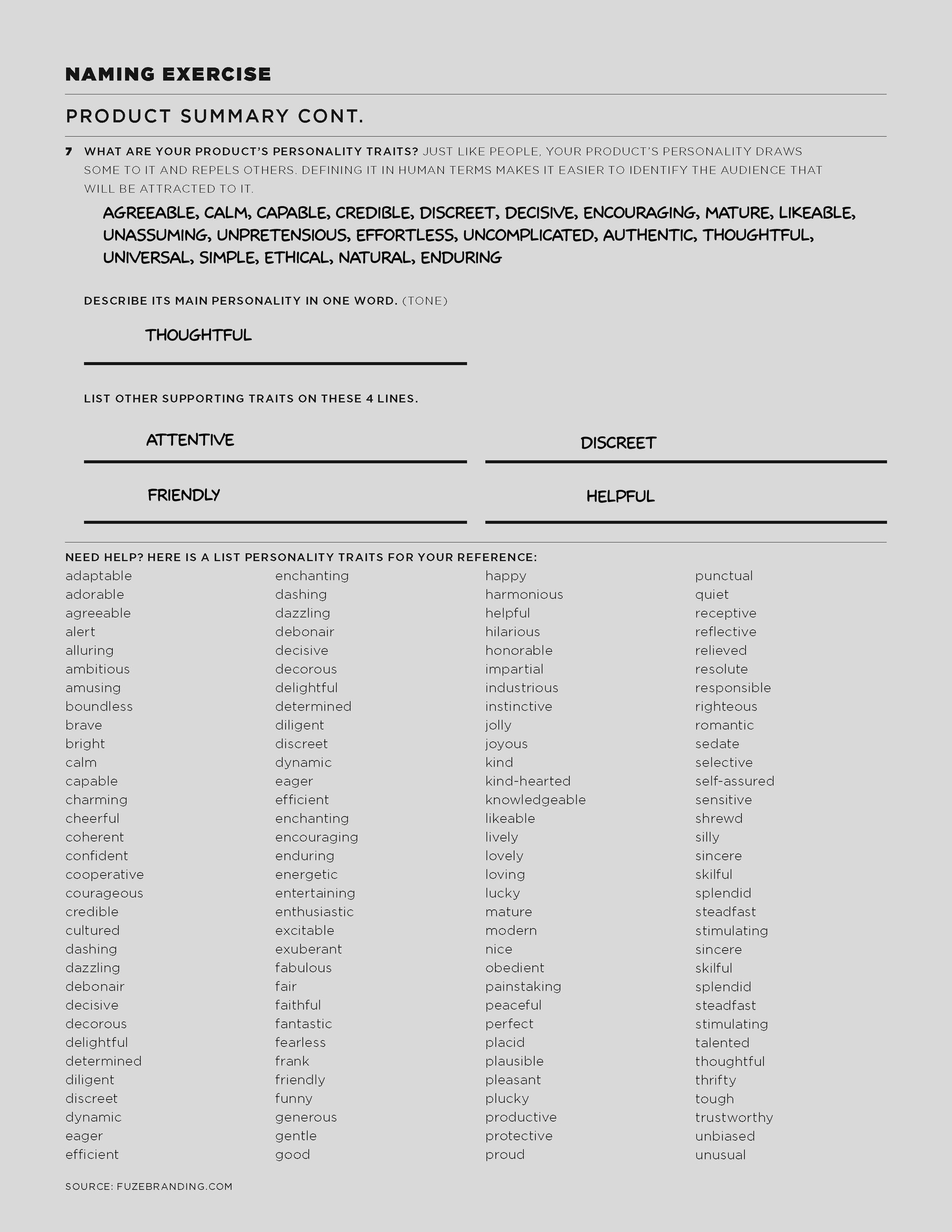
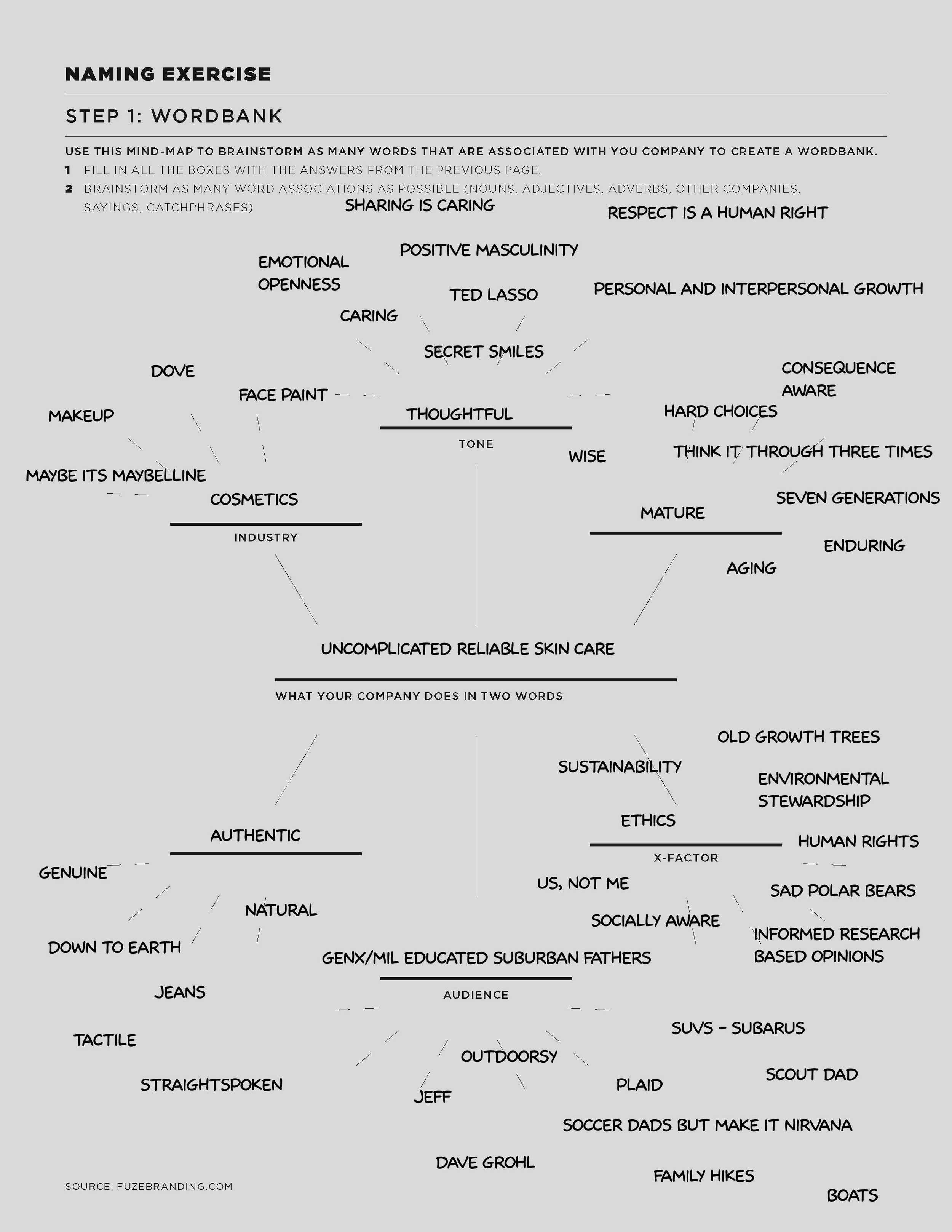
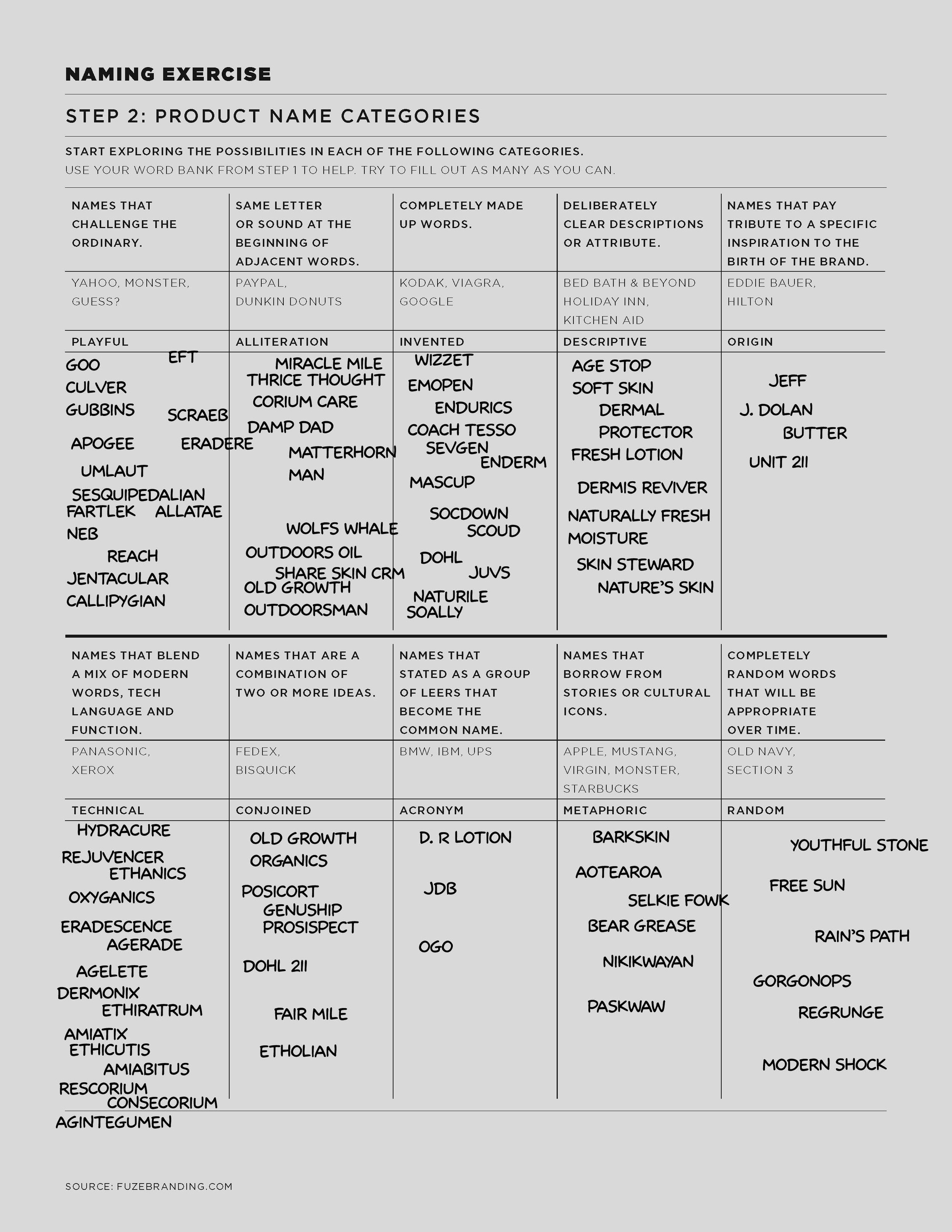
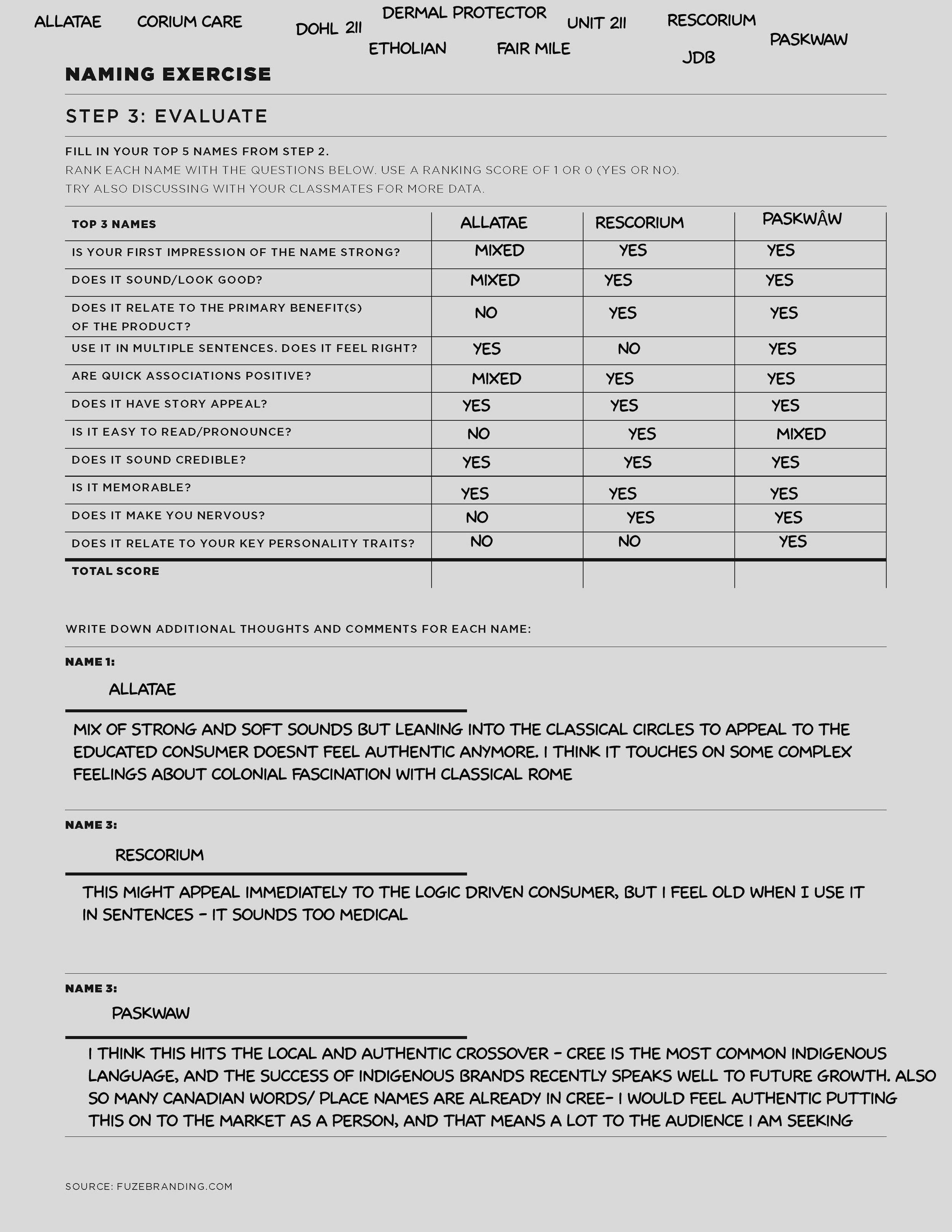

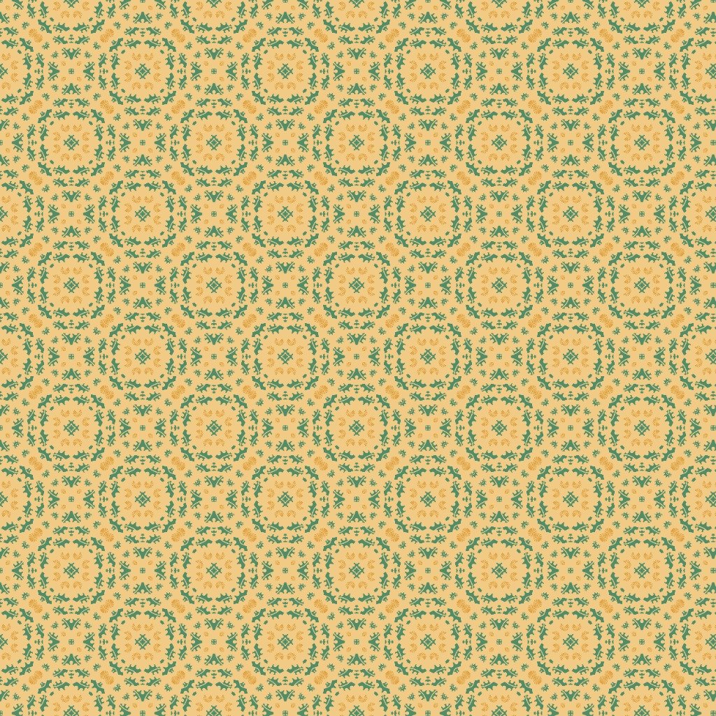
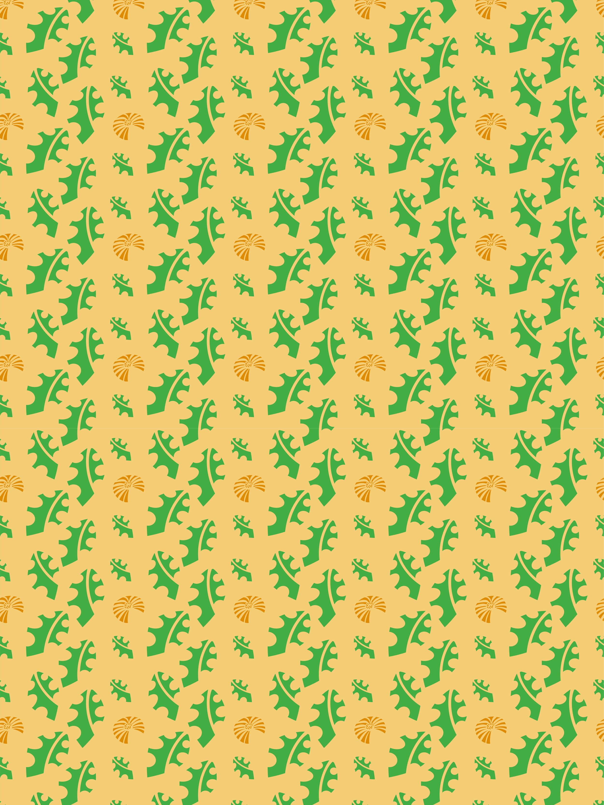

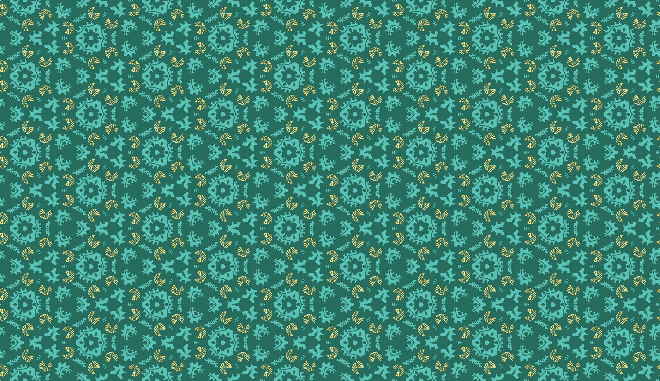
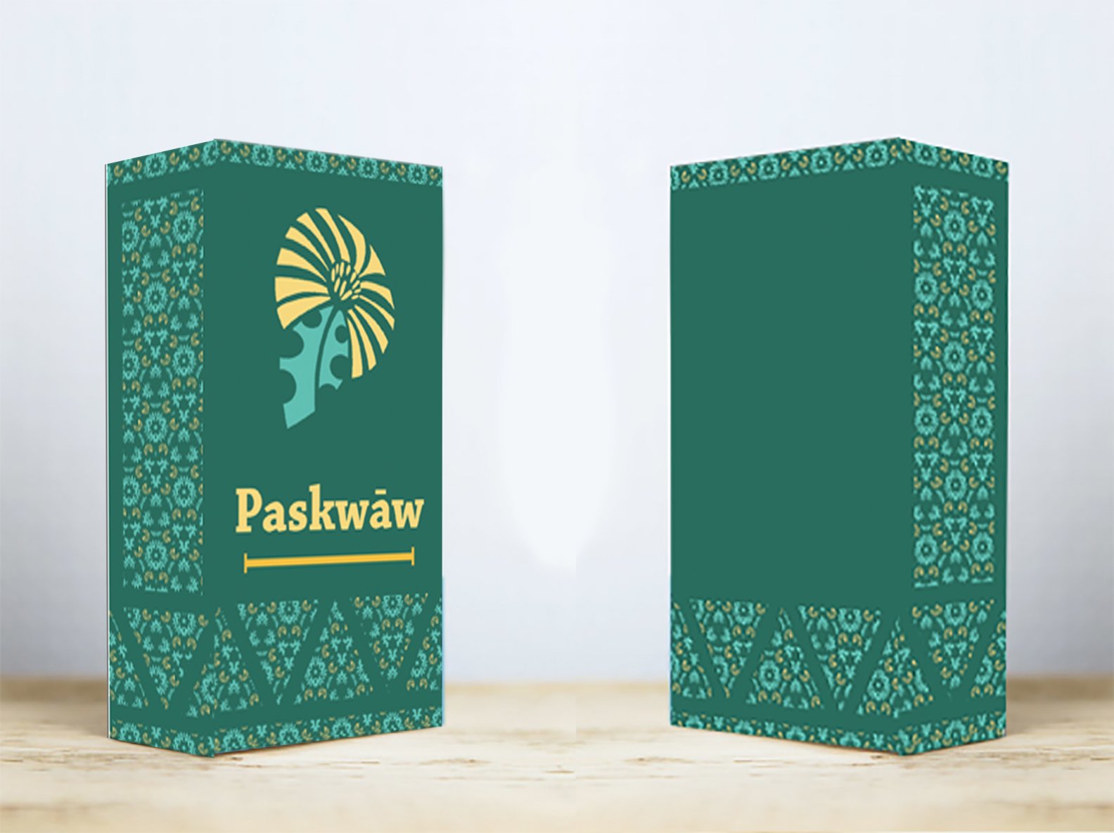

As a design student, not every project is going to be an illustration. There’s still value in that though - this project shows a portion of the depth of research, thought and consideration that goes into a well-made package design. Step by step, the process builds upon itself, from market research, to audience personas, product naming, logo design, palette considerations, pattern creation, templating and mockups. Without one step, there is an inherent weakness in the product. Ideally, this process becomes so natural that it appears as intuition and each design works effortlessly each time.